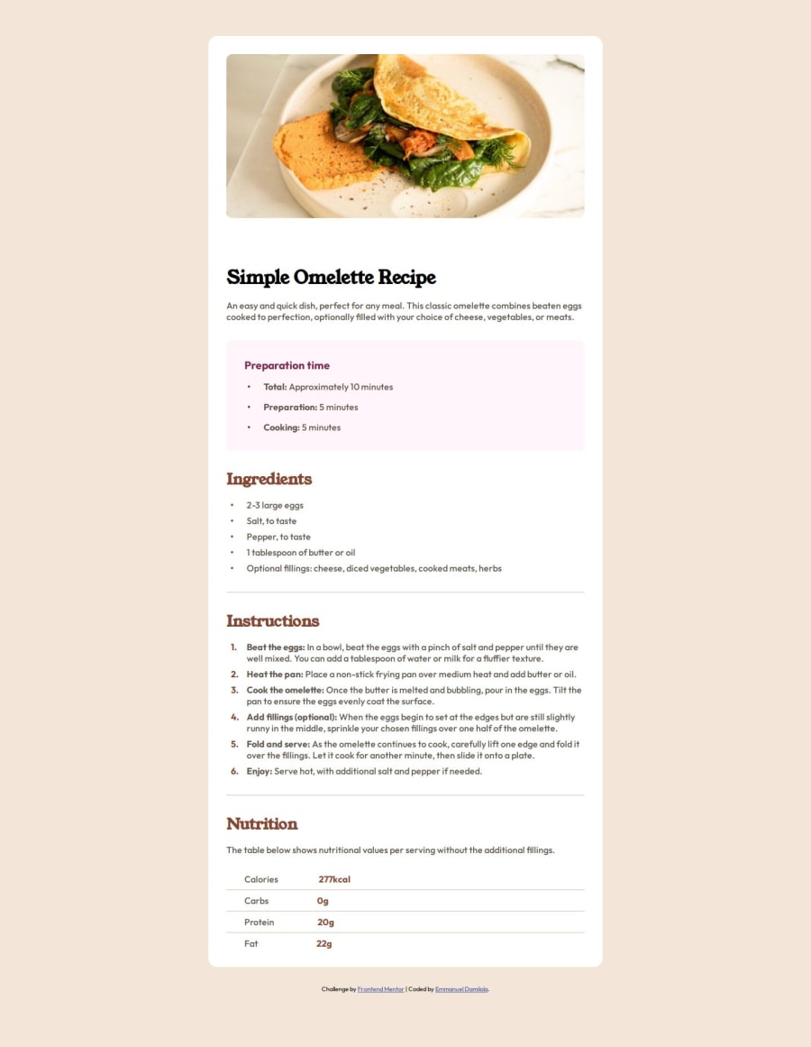


Design comparison

Solution retrospective
- I am glad I got to work with vanilla css again.
- Making the design up to par
- Training my eye to get a pixel perfect solution for designs.
Please log in to post a comment
Log in with GitHubCommunity feedback
- @Daniel-C04
Great solution. But at the bottom to position the second column of the table, you can try:
.omelette-nutrition .nutrition-table-value { display: flex; margin-top: 1rem; gap: 0.5rem; }
.nutrition-table-value .nutrient { margin-left: 2rem; margin-right: 17rem; width: 15px; } Instead of giving him margin one by one.
- @robinsonexe
Great solution overall but I noticed the second column of the table at the bottom of the solution isn't spaced correctly, I could not view the code from the repository to give an accurate solution but you can always try using a text align or maybe a margin to help position it properly.


Join our Discord community
Join thousands of Frontend Mentor community members taking the challenges, sharing resources, helping each other, and chatting about all things front-end!
Join our Discord