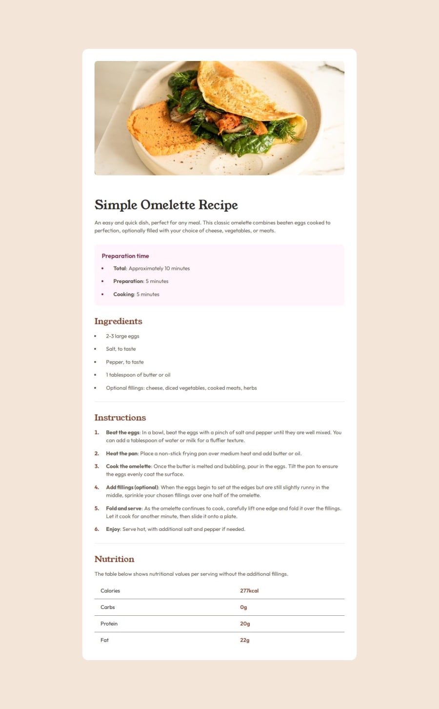
Design comparison
Solution retrospective
It was a bigger project than the last ones that I was happy with. I'm happy to have completed the challenge.
What challenges did you encounter, and how did you overcome them?I had problems adjusting the table and getting it close to the proposed design. I needed to test some attributes to see how the styling was affecting the table. I didn't know how to style bullet points, it was a good opportunity to learn.
What specific areas of your project would you like help with?Was I able to make my HTML semantic? Any tips will be very welcome.
Community feedback
- @roopxxPosted about 1 year ago
Hey @souza-vitor,
Great job on completing your project, it looks good!
In terms of HTML semantics, try using specific tags like <header>, <nav>, <main>, etc., instead of just <div>. I, myself, is beginner but looking at your html, it looks semantic.
Keep up the good work!
1@souza-vitorPosted about 1 year agoThank you for the feedback, @roopxx. I really appreciate it!
1
Please log in to post a comment
Log in with GitHubJoin our Discord community
Join thousands of Frontend Mentor community members taking the challenges, sharing resources, helping each other, and chatting about all things front-end!
Join our Discord
