Design comparison
Solution retrospective
My more optimal usage of CSS, alongside using media query which was a first for me.
What challenges did you encounter, and how did you overcome them?Media query was the hardest part, i had to fit everything on a smaller screen
What specific areas of your project would you like help with?I think my media query usage was lacking here, it got the job done; but it could've been far better.
Please log in to post a comment
Log in with GitHubCommunity feedback
- @AidenT11
I really like how well this turned out! This is my next challenge so hopefully I can execute it as well as you have. I also see in your code you use flex. Do you prefer it over grid or it just your go to standard and you never use grid?
- @thecodefan
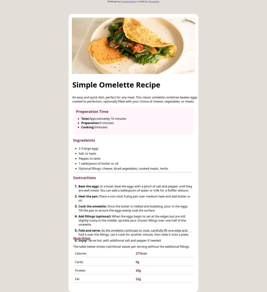
By the way, for some reason in the screenshot the bottom part is messed up, this isn't the case on the live website, both on mobile and desktop.
Join our Discord community
Join thousands of Frontend Mentor community members taking the challenges, sharing resources, helping each other, and chatting about all things front-end!
Join our Discord
