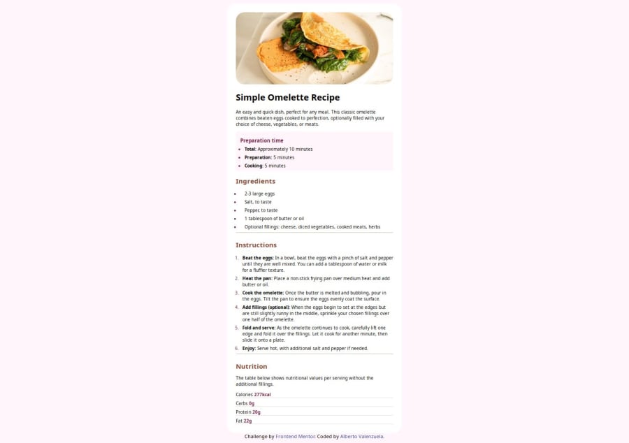
Design comparison
Community feedback
- @zacc-anyonaPosted 8 months ago
Hello Alberto,
You have done a great job taking your time and commitment to complete this challenge. But there are a few areas you can improve on;
-
Use of modern CSS reset: Always apply the latest modern reset in your projects. It will make designing a web page become a breeze. This article will get you up to speed with modern css selectors.
-
Use of landmarks: Starting from now start using HTML5 landmarks such as
<main></main>,<footer></footer>&<article></article>. Using of landmarks contributes greatly on your webpage's accessibility. It also lets the search engines and screen readers know the flow of content in your webpage. Refuse to suffer from this disease called 'Divitis'. It is a pandemic! :) Learn and know how to use landmarks here.
Generally you have done well. I love it. If you find my comment helpful, don't forget to mark it as helpful and give me an upvote.
Marked as helpful1@AlbertoVaMaPosted 8 months agoYeah Thanks for the advices! I only have problems with the spacing in the “table” from the bottom, I didn’t realize the color of the background and let it that way.
I’m proud cause I been learning HTML and CSS around past two weeks so step by step :) @zacc-anyona
0 -
Please log in to post a comment
Log in with GitHubJoin our Discord community
Join thousands of Frontend Mentor community members taking the challenges, sharing resources, helping each other, and chatting about all things front-end!
Join our Discord
