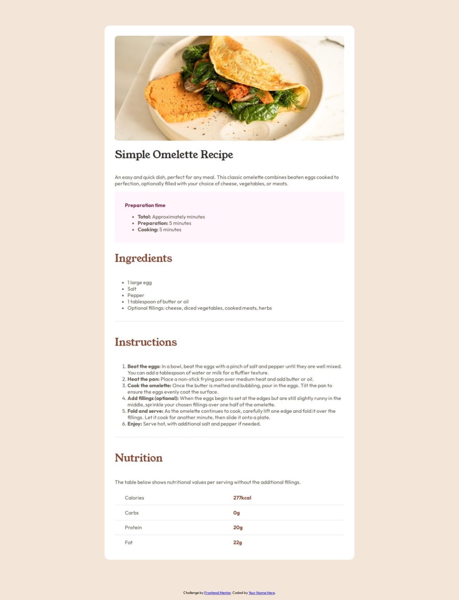
Design comparison
Solution retrospective
Definitely for me the biggest challenge was the table of values, it was difficult for me to organize it in the same way as in the challenge, it was difficult for me to roll an element without affecting the other column but I managed to do it using a relative position as an argument.
What specific areas of your project would you like help with?You can't make the responsive project for cell phones look the same, I couldn't make the image enlarge, occupying the entire top part as the design shows, I still need to learn that responsive part using only CSS.
Community feedback
- @Hazel-DavidPosted 10 months ago
Hello fellow coder, here some little help. To make your project a bit responsive without complication of things, I advice you implement relative units such as em and rem rather than px. This is because px tend rather to be fixed than adaptive. I hope this helps. Like if it helps
0@AlexSG29Posted 10 months ago@Hazel-David Yes, I used rem throughout the code but in the figma design the recipe image expands to 100%, while on desktop it doesn't, I didn't know how to do that using CSS. thanks for the feedback
0
Please log in to post a comment
Log in with GitHubJoin our Discord community
Join thousands of Frontend Mentor community members taking the challenges, sharing resources, helping each other, and chatting about all things front-end!
Join our Discord
