Design comparison
SolutionDesign
Solution retrospective
What are you most proud of, and what would you do differently next time?
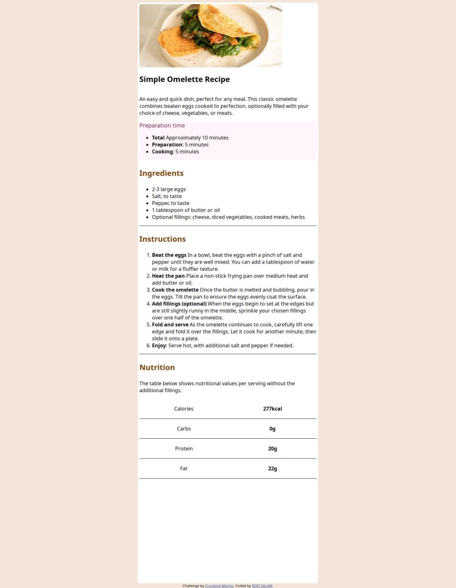
Hey developers, i tried my first frontend mentor. please take a look at it and give me the feedback on what you think i should have done better. what you think i could do to improve, or even better, i am open to all correction. Thanks for your time.
Community feedback
Please log in to post a comment
Log in with GitHubJoin our Discord community
Join thousands of Frontend Mentor community members taking the challenges, sharing resources, helping each other, and chatting about all things front-end!
Join our Discord
