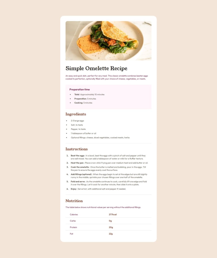
Design comparison
Solution retrospective
Proud of implementing approx. same ui design. I can use display gird for making table layouts.
What challenges did you encounter, and how did you overcome them?I found difficult to mimic last nutrition section layout. I overcome this challenge by learning table, tr, td tags and play around with padding, border properties.
What specific areas of your project would you like help with?I think I got this from my side, But any help would be appreciated, thanks :)
Community feedback
- @rahulkumar215Posted about 1 year ago
Hello @KaushalSonic👋
Congratulations on successfully completing the challenge! 🎉
I have a suggestion regarding your code that I believe will be of great interest to you.
- For the description of the Omelette Recipe and Nutrition, their text color is different from the design, so you should set their color as
color: var(--Wenge-Brown);
I hope you find this helpful 😄 Above all, the solution you submitted is great !
If you need any feedback or suggestions, I am happy to help
Have Fun Coding!
Marked as helpful1 - For the description of the Omelette Recipe and Nutrition, their text color is different from the design, so you should set their color as
Please log in to post a comment
Log in with GitHubJoin our Discord community
Join thousands of Frontend Mentor community members taking the challenges, sharing resources, helping each other, and chatting about all things front-end!
Join our Discord
