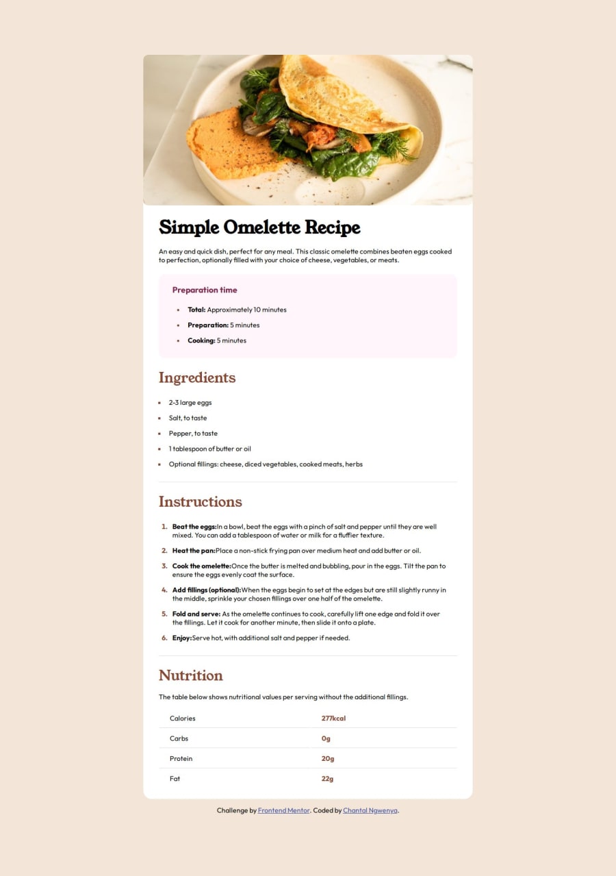
Design comparison
Community feedback
- @StroudyPosted 2 months ago
You are smashing these challenges out and given out feedback! What a champ! Few things I can give you here...
-
Setting the
widthandheightfor an<img>helps the page load faster and prevents content from jumping around as the image loads. This is good for performance and improves user experience. However, if your image needs to keep a consistent shape (aspect ratio) across different screen sizes, it's better to use the CSSaspect-ratioproperty instead. -
Using
remoremunits in@mediaqueries is better thanpxbecause they are relative units that adapt to user settings, like their preferred font size. This makes your design more responsive and accessible, ensuring it looks good on different devices and respects user preferences. -
I think you can benefit from using a naming convention like BEM (Block, Element, Modifier) is beneficial because it makes your CSS more organized, readable, and easier to maintain. BEM helps you clearly understand the purpose of each class, avoid naming conflicts, and create reusable components, leading to a more scalable codebase. For more details BEM,
-
You could use a full modern reset aswell.
I look forward to seeing more from you! Happy Coding! 🚀
1 -
- @skmojidPosted about 2 months ago
hey Friend, you are doing well. In this project you have to do pading in picture image and correct the font weight.
0
Please log in to post a comment
Log in with GitHubJoin our Discord community
Join thousands of Frontend Mentor community members taking the challenges, sharing resources, helping each other, and chatting about all things front-end!
Join our Discord
