Submitted 4 months ago
Recipe Page
#accessibility#react#tailwind-css#vite#typescript
P
@besopmac
Design comparison
SolutionDesign
Solution retrospective
What are you most proud of, and what would you do differently next time?
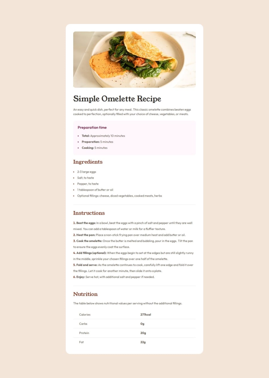
This is the initial page to kickstart the project. I chose to build it using React, TypeScript, and TailwindCSS to establish a solid foundation for future expansion. My plan is to develop a simple Recipe API (or potentially integrate an existing one) and gradually add more advanced components as the project evolves.
What challenges did you encounter, and how did you overcome them?I struggled with applying Tailwind classes to lists. I’m sure there’s a way to style unordered and ordered lists to match the design in Figma.
Community feedback
Please log in to post a comment
Log in with GitHubJoin our Discord community
Join thousands of Frontend Mentor community members taking the challenges, sharing resources, helping each other, and chatting about all things front-end!
Join our Discord
