Design comparison
Community feedback
- P@SherrisaPosted 6 months ago
Great work, your project shows so much attention to detail!
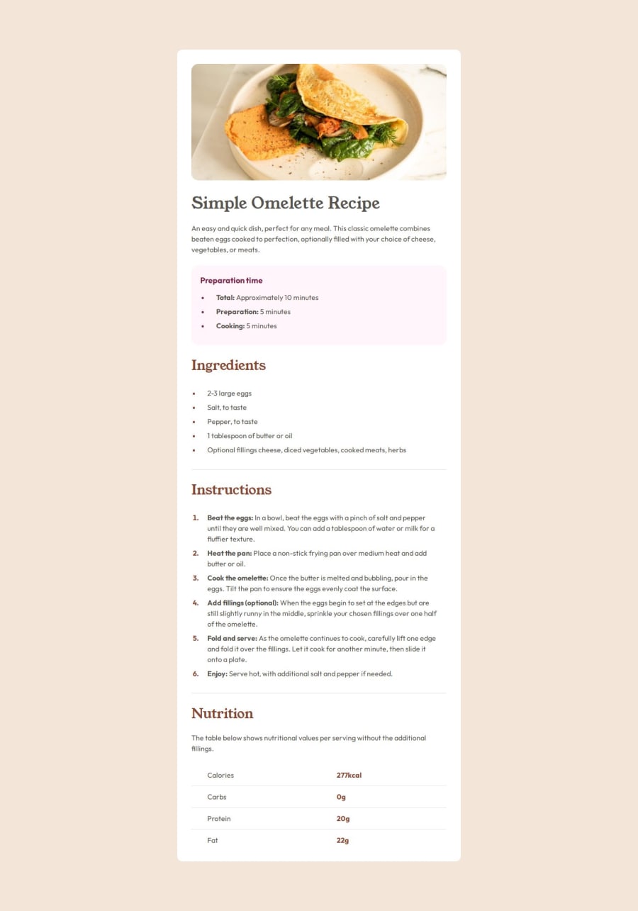
The only thing that stands out to me is that your solution title is taking on the stone600 color of the body. It looks like this is because the title, Simple Omelette Recipe, is missing a text-stone900 class.
Also, the Figma file shows the max-width of the container for tablet as 616px and 736px for desktop, but I don't see this in your code. This may be why your solution is narrower and longer than the design in the image above.
Marked as helpful0
Please log in to post a comment
Log in with GitHubJoin our Discord community
Join thousands of Frontend Mentor community members taking the challenges, sharing resources, helping each other, and chatting about all things front-end!
Join our Discord
