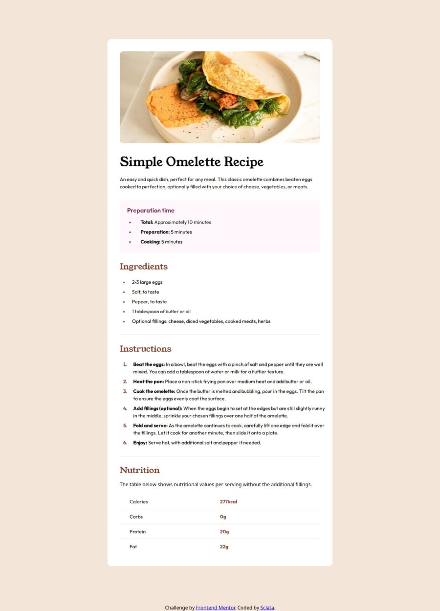
Design comparison
Solution retrospective
This is my first attempt at any sort of front-end work, so I'm definitely pleased with the outcome. I did the exercise twice, one with "raw" CSS and HTML, and then I went back and refactored, attempting to apply some best practices with SCSS/BEM (hadn't heard of them prior). I still need to work on naming schemes, logical grouping, SCSS partitioning, and component composition. There's so much to learn with CSS, and I think the most obvious starting point for improvement is relative unit sizing.
What challenges did you encounter, and how did you overcome them?The biggest challenges I encountered were:
- How scaling and padding impact the look of an image (and their impact on border radii).
- Generated content and applying styling to them (specifically list markers in this case).
- Using pseudo-selectors to isolate specific exceptions to other rules in the cascade. (for example, dropping a border from only the last table elements)
- Implementing media queries for dynamic sizing.
I think I made good progress. I learned a lot in this first project, and I'm obviously still working hard to outline a standard approach / best practices. I think I answered my own questions and will focus on implementing more accessibility and relative sizing in upcoming projects, as well as trying my hand at container queries.
Join our Discord community
Join thousands of Frontend Mentor community members taking the challenges, sharing resources, helping each other, and chatting about all things front-end!
Join our Discord
