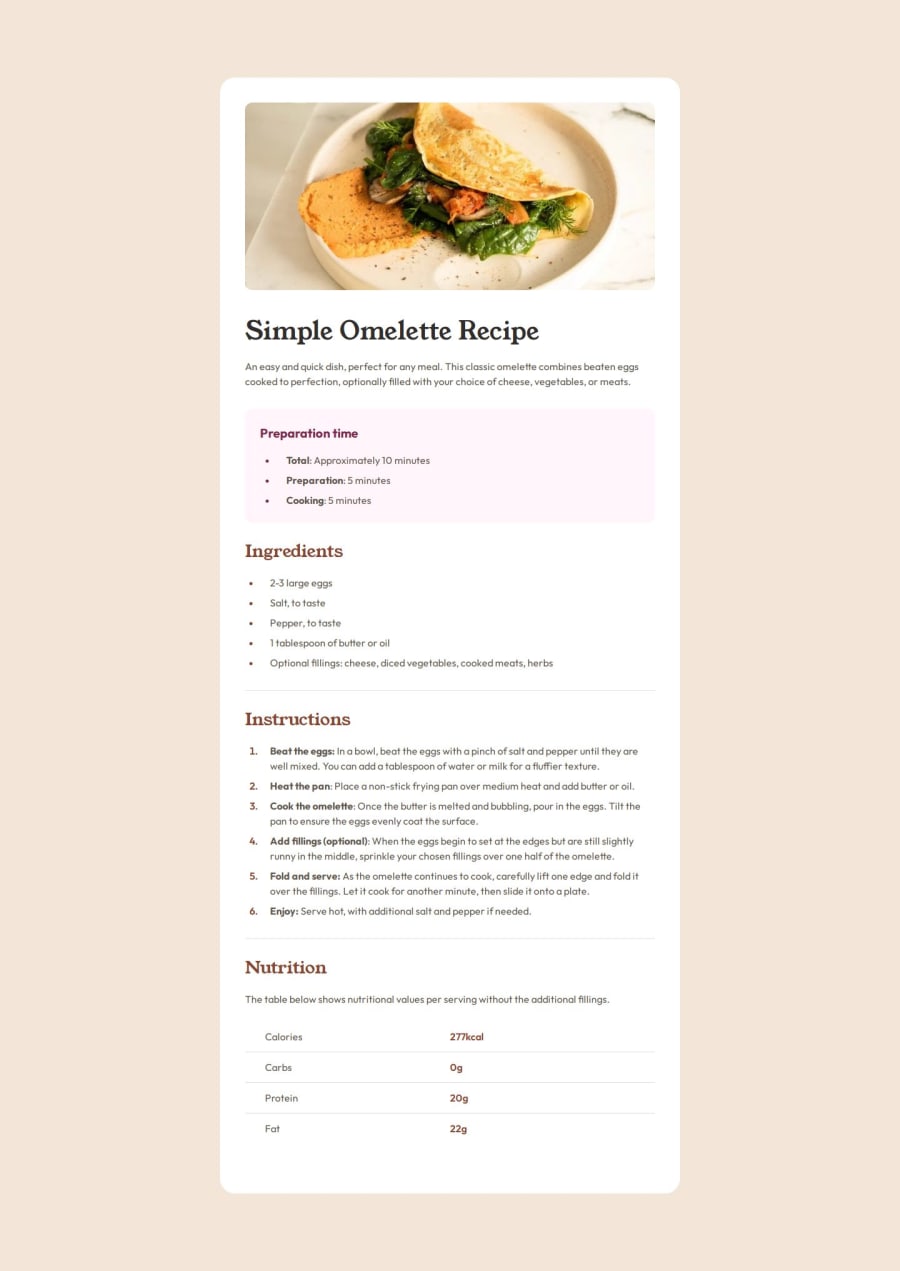
Recipe page with React (+ Vite) & Simple CSS ✨
Design comparison
Solution retrospective
Hey ✌
This challenge was pretty nice. At first I thought maybe something is missing from the mobile design, but then I thought about it and did it as we see it. 😀
The display: none; and the display: block; rules makes sure to show the Ingredients part of the recipe when the brower width is greater than 700px.
Everything else is simple. When I uploaded the files I did a Lighthouse test, and I think I'll resize the omelette picture and do some Squosh too in the future. A WebP format would be great I think.
Here is a link to the Squoosh website. Pretty awesome thing. - Squoosh
I hope you like my solution.
Leave a comment if you think I should change something. ✌
Edit: I've changed the image from JPEG to WebP and my h1 font-weight was 700, so I had to change that too. ✅
Community feedback
Please log in to post a comment
Log in with GitHubJoin our Discord community
Join thousands of Frontend Mentor community members taking the challenges, sharing resources, helping each other, and chatting about all things front-end!
Join our Discord
