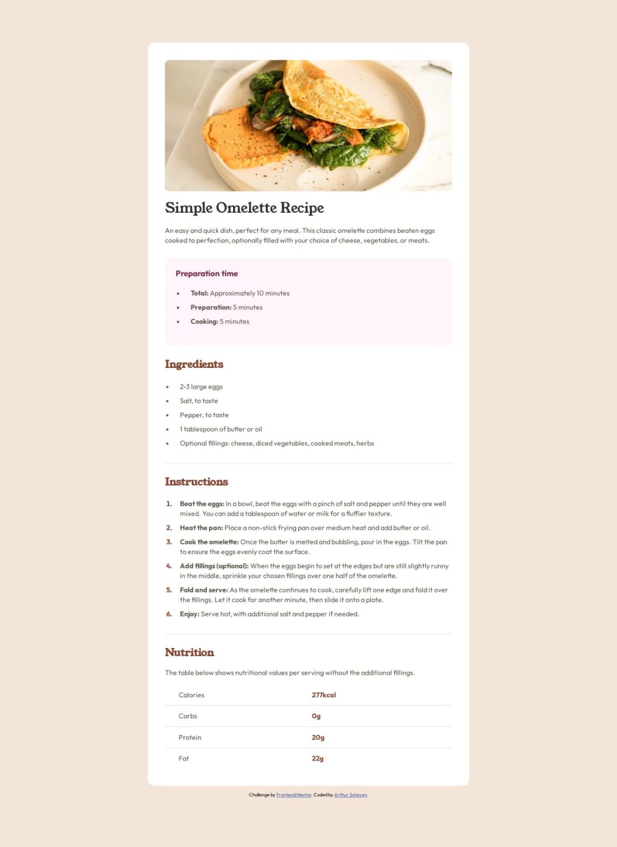


Design comparison

Solution retrospective
This was a tougher one and things are starting to get more complicated, overall I think it is more accurate than I had hoped.
What challenges did you encounter, and how did you overcome them?I got to learn about a few new properties for elements I don't use much. Notably the table and (un)ordered lists and list items. For example table-layout and border-collapse.
I'm really struggling with the recipe image for the mobile layout. I'm not sure how to make it take up the full width because the padding is in the way, but I can't reasonably get rid of the padding without restructuring the HTML, so I suspect I didn't structure the HTML adequately. I would appreciate advice on this.
Community feedback
- @uzainmalik123Posted about 2 months ago
i mean you could just split it into two containers the image and the content use flex-direction column and set the image container width and height and just put the image as a background don't use a image tag.
0 - P@DonahuecPosted about 2 months ago
I didn't look into the whole solution, because I am tired and just saw this in passing. But I thought I would pop in and give you a hint for the image: you can give the image a negative margin equal to the container padding on small screens, which allows it to expand outside of it's container :)
0@uzainmalik123Posted about 2 months ago@Donahuec negative margin you know that would be bad practice that would dodging the problem instead of solving it.
0P@DonahuecPosted about 2 months ago@uzainmalik123 Negative margins aren't bad practice, they are a fully supported part of the css spec, and an industry standard way of solving the problem of needing to break an element out of the limitations of it's parent's box model. This isn't some hacky solution, it is the most common way of solving this problem, and I've even seen it taught in css courses.
In this case, semantically, you want the image contained within the card, and logically you want the padding applied to the whole card, as applying it to individual elements is more prone to bugs. you specifically want a single element to visually expand past the container on smaller screens. Frequently you will be limited in your html structure or semantic html, and will need to find ways to visually 'break out' of it while leaving the page structure the same, this is one of those ways.
As you learn more, you will find that frequently standard css solutions feel hacky or like tricks. and that is because they are. The history of web design has been entirely about bending the limitations of the web document model to our designs, and finding the simplest or most efficient way to do that. At least we don't really need to deal with floats and clearfix solutions anymore, because those were peak hacky :P
Marked as helpful1@arthur-scheveyPosted about 2 months ago@Donahuec Thanks for the help! I was also worried about the negative margin thing since it felt dubious. I appreciate the info though so it looks like it's just another thing to add to my tool belt as I learn.
0@uzainmalik123Posted about 2 months ago@Donahuec ok that might be a way you can use but there are so much better ways than adding negative margin or anything but I am saying a person that does not know what they are doing they might get stuck so finding better ways like a easy simple way is just to split the containers into two parts negative margin is just dodging the problem and you know if anyone build more projects and they have used negative margin before they will do it again instead of finding a better way because negative margin is so easy to apply just one line of code.
But you do you I don't think its a good way but if you do think just keep at it and use negative margin, padding and anything.
0


Please log in to post a comment
Log in with GitHub
Join our Discord community
Join thousands of Frontend Mentor community members taking the challenges, sharing resources, helping each other, and chatting about all things front-end!
Join our Discord