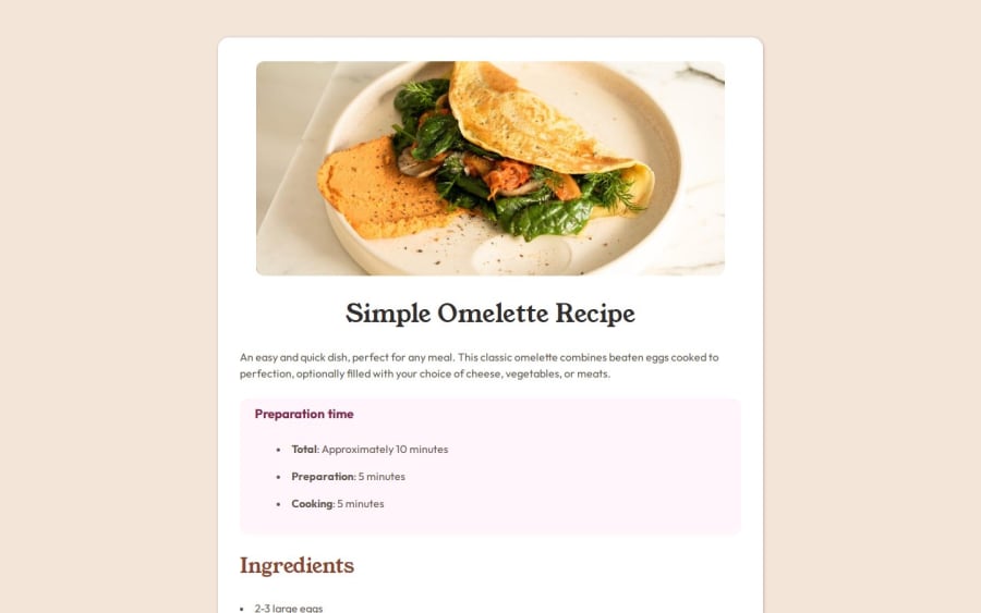


Design comparison

Solution retrospective
I had a lot of trouble with the height of the main element. I had to set a fixed value to make the page look nice because otherwise, the background would only go as far as before the first section started.
Besides that, there were small details I couldn't figure out, like increasing the distance between list bullets and the start of the sentences, changing the color of the bullets, and aligning the text inside lists so that the second line starts at the same point as the first. I think this last part might be confusing. For example:
I couldn't get it to look like this:
- XXXXXX
XXXXXX
Instead, it turned out like this:(ignore the "_", it's just a space)
- __XXXXXX
XXXXXX
Anyway, I struggled, but I managed to make it work.
I’d love any advice—it's very welcome! 😊
Community feedback
- @YacoubDweikPosted 21 days ago
Hey! good job!
Solving Your HTML & CSS Issues
1. Fixed Heights: Never ever set a fixed height to a container like the way you did here, because right now the content is out of the body & main, because what works in your screen does not always work for others, instead if you don't set a fixed height then it's gonna be fit-content and that's what you want right? I don't see any benefit of setting a fixed height, BTW you can use min-height in some cases where you really need kind of fixed height, it is like say your height is gonna be a range from min-height to fit-content, so no overflow and no height below min-height.
2. Semantic HTML Elements
Semantic elements improve readability and accessibility. Here's when to use them:
<main>: The main content of the page (one per page).<section>: Groups related content within a page (e.g., a services section).<article>: Represents a standalone, self-contained piece of content (e.g., blog post, news).<aside>: Side content (ads, related links).<header>: Introductory content (titles, navigation).<footer>: Footer of a page or section.
Example:
<main>
  <section>
    <article>
      <h2>Blog Post Title</h2>
      <p>Content of the article...</p>
    </article>
  </section>
  <aside>
    <p>Related links or ads</p>
  </aside>
</main>
3. Customizing
<li>Bullet PointsYou can change the bullet style using
list-style-typeor completely replace it with a custom icon.Example:
ul {
  list-style: none; /* Remove default bullets */
  padding-left: 0;
}

ul li {
  position: relative;
  padding-left: 20px; /* Space for the custom bullet */
}

ul li::before {
  content: "";
  position: absolute;
  left: 0;
  top: 50%;
  width: 8px; /* Bullet size */
  height: 8px;
  background-color: brown; /* Brown color */
  border-radius: 50%; /* Makes it a circle */
  transform: translateY(-50%); /* Centers it vertically */
}
4. Fixed Space Between Two Words:
To position words on opposite sides, use
flexbox.flex-container { display: flex; justify-content: space-between; }<div class="flex-container"> <span>Left</span> <span>Right</span> </div>
5. General Advice for Responsive Web Apps
-
Use Relative Units (
%, vh, vw, em, rem)- Avoid fixed pixels for widths/heights.
- Example:
width: 80%;instead ofwidth: 800px;.
-
Use
max-widthInstead of Fixed Widths- Example:
max-width: 1200px; margin: auto;.
- Example:
-
Use Flexbox & Grid for Layouts
- Example:
.container { display: flex; flex-wrap: wrap; gap: 10px; } -
Make Images & Videos Responsive
- Use:
img { max-width: 100%; height: auto; } -
Test on Different Screen Sizes
- Use Chrome DevTools (
Ctrl + Shift + I→ "Toggle Device Toolbar").
- Use Chrome DevTools (
-
Use
remandemfor Font Sizes- Keeps text responsive.
-
Apply
@mediaQueries for Responsiveness@media (max-width: 768px) { .container { flex-direction: column; } }
Hope this helps! 🚀 Let me know if you need further clarifications.
Marked as helpful1 - @nilikopoPosted 21 days ago
Hi,
Distance between <li> and marker:
list-style-position: inside;andtext-indent: -2rem;are blocking the way to put distance between list bullets and start of the sentence with usingpadding-left: 2rem;orpadding-inline-start: 2rem;.It will also fix text aligning inside list.
u can use pseudo-element
::markerto change the color of markerscode i used
.instructions-item::marker {
    color: var(--color-brown800);
    font-weight: 600;
}
Height of main element: i removed every fixed height in media queries and in main block:
height: XXXremin@media,height: 206.9rem;inmain. Then i removed fixed height inhtml, bodyand set it toheight: auto;and added additionalpadding-bottom: 4rem;tomainelement.Marked as helpful1


Please log in to post a comment
Log in with GitHub
Join our Discord community
Join thousands of Frontend Mentor community members taking the challenges, sharing resources, helping each other, and chatting about all things front-end!
Join our Discord