

Design comparison

Solution retrospective
I am proud of how close/similar I made my page to the target. There was a lot of classes I had to create in order to style several elements differently, and I managed to style all of them successfully despite feeling slightly overwhelmed.
This was also my first time using the '@media' property and relative measurements such as 'rem' and 'em'. As much as I used them in this challenge, I wish I instead took more time to understand what they actually did before I started implementing it.
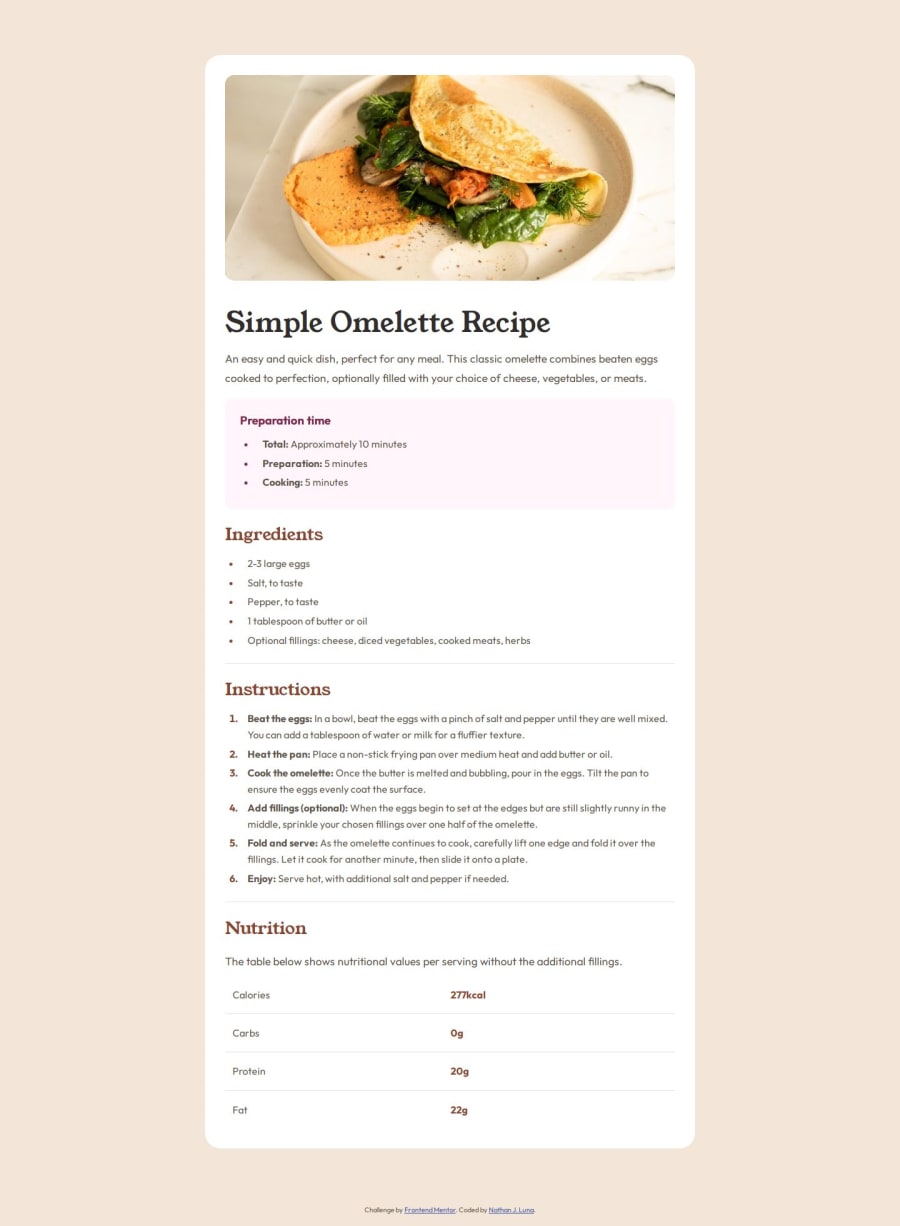
What challenges did you encounter, and how did you overcome them?I struggled with styling the table and using the tag, because I haven't really used them at all until now. As for overcoming, I ended up having to look at outside resources on how to style tables.
More specifically, when I added lines in between table rows, I was having trouble with excluding the border line for the very last row of the table, as that was not meant to be shown like in the target-design images.
What specific areas of your project would you like help with?I would like to get more help and polish more on how to use relative measurements and how to use the '@media' property. Quite a few comments mentioned that I needed to have more semantics in my code, so I tried implementing more, however I'm not sure whether I am doing it correctly.
Community feedback
Please log in to post a comment
Log in with GitHubJoin our Discord community
Join thousands of Frontend Mentor community members taking the challenges, sharing resources, helping each other, and chatting about all things front-end!
Join our Discord