Design comparison
Community feedback
- @awheelrPosted 6 days ago
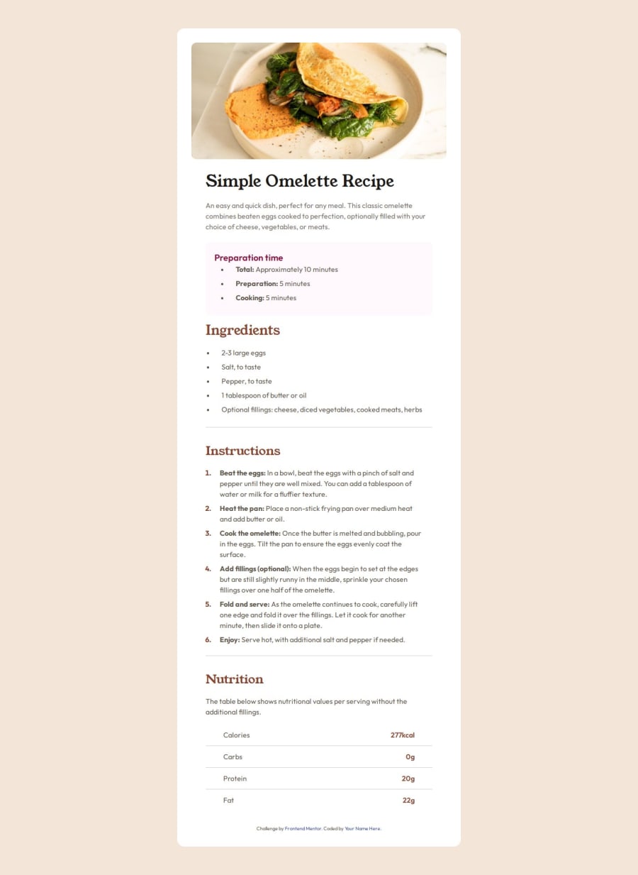
Hey there Abudullah, you did a great job and it looks well done! I can only offer some minor critiques about styling. I think the section that holds all of the recipe information below the image could've gone without padding around it, that way you use all available space for the content. Also, the Nutrition section looks great as is, but I would consider using a table as it's likely the "proper" way of handling that section of content. Other than that I'll tell you the same thing I keep telling myself which is to work on using semantic elements within your html when it makes sense. For example all of the content on this page is basically divided into sections which makes it the perfect place to use the <section> element. Hope that helps in some way and good luck on your future projects!
0
Please log in to post a comment
Log in with GitHubJoin our Discord community
Join thousands of Frontend Mentor community members taking the challenges, sharing resources, helping each other, and chatting about all things front-end!
Join our Discord
