Design comparison
SolutionDesign
Solution retrospective
What challenges did you encounter, and how did you overcome them?
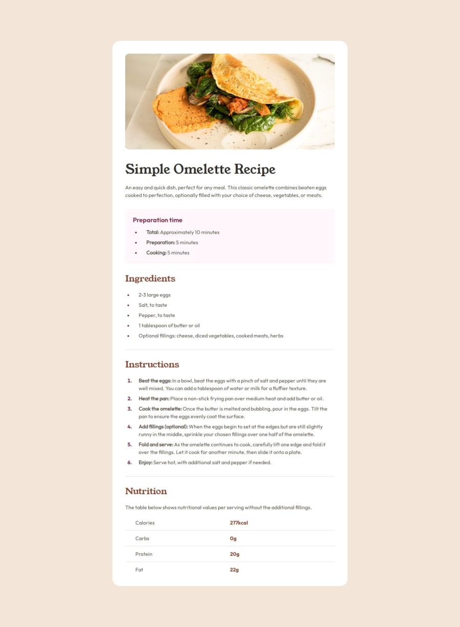
I got stuck a bit while trying to design the lists and the table at the bottom of the page. It was hard to follow the figma design file for those parts. I end up using padding for the list bullet points and numbers and also the text that follows.
Community feedback
Please log in to post a comment
Log in with GitHubJoin our Discord community
Join thousands of Frontend Mentor community members taking the challenges, sharing resources, helping each other, and chatting about all things front-end!
Join our Discord
