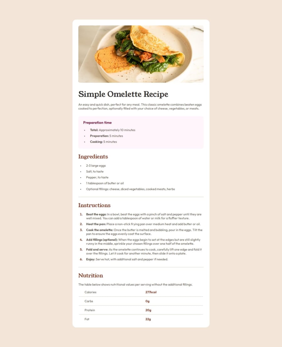
Design comparison
SolutionDesign
Solution retrospective
What are you most proud of, and what would you do differently next time?
That I finished it. Probably wasted time/put too much effort into the spacing between the bullet points and the actual text. As you will see in the CSS code.
What challenges did you encounter, and how did you overcome them?.
What specific areas of your project would you like help with?Maybe an easier/better way to space or structure.
Join our Discord community
Join thousands of Frontend Mentor community members taking the challenges, sharing resources, helping each other, and chatting about all things front-end!
Join our Discord
