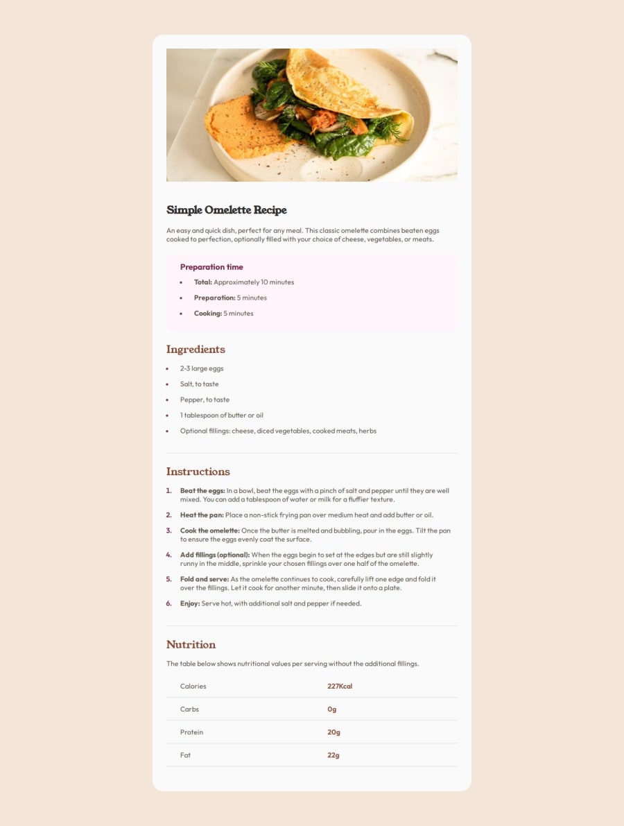
Design comparison
Solution retrospective
Being able to find solution on the CSS challenges I had in this project.
What challenges did you encounter, and how did you overcome them?I had a challenging time aligning the li which causes confusing for me at first. I didn't expect changing the padding and margin at default * {} will make the be outside its parent container.
Had a challenge to create spacing between the and it's content. Able to findsolution researching and this is the resource https://css-tricks.com/everything-you-need-to-know-about-the-gap-after-the-list-marker/
What specific areas of your project would you like help with?I think I still have shallow understanding about different CSS properties and it's effect on different elements or properties.
Join our Discord community
Join thousands of Frontend Mentor community members taking the challenges, sharing resources, helping each other, and chatting about all things front-end!
Join our Discord
