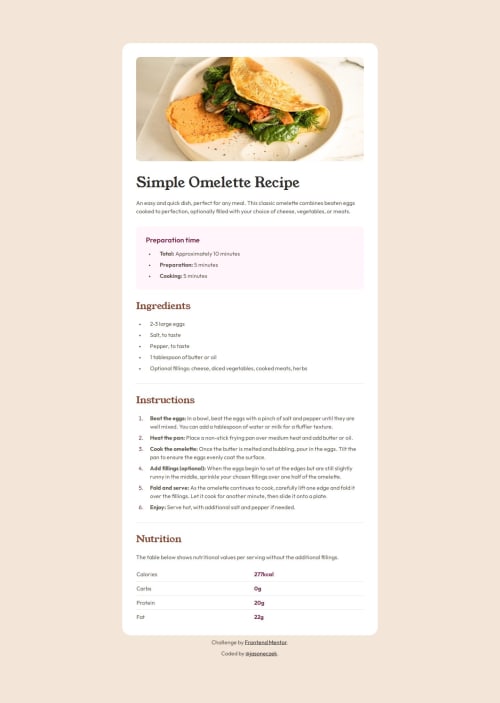
Recipe Page with custom properties, dynamic padding and layout

Solution retrospective
I challenged myself to build responsive layouts for mobile and desktop screen sizes without using media queries. For this I used a combination of CSS math functions: min(), max(), clamp() to dynamically adjust padding sizes, margins and font sizes to match the Figma files. I was able to very closely match the design using this technique.
What challenges did you encounter, and how did you overcome them?By far the most challenging part was making the border radii of the main card component and the image responsive: from 0 on mobile screens to their respective sizes on larger screens. I found a great article which really explains how this works and adapted the solution to my needs. There is a link to this article on the README page if you are interested. I had to make some decisions as well in other areas that required some thought. For example, the horizontal lines under the ingredients and instructions lists. It could be an , or could be a border-bottom for those entire sections. I went with the latter. It made sense to me to use last-child, not last-child pseudo selectors here and there for stuff like this. Is this the best way? I'm not sure!
What specific areas of your project would you like help with?I'm grateful for any feedback on how to improve. One thing in particular I couldn't figure out is how to vertically center the bullet points on the unordered lists. In the design they appear to be center aligned with the text in the list item rather than aligned to the top of their box.
Please log in to post a comment
Log in with GitHubCommunity feedback
No feedback yet. Be the first to give feedback on jasoneczek's solution.
Join our Discord community
Join thousands of Frontend Mentor community members taking the challenges, sharing resources, helping each other, and chatting about all things front-end!
Join our Discord