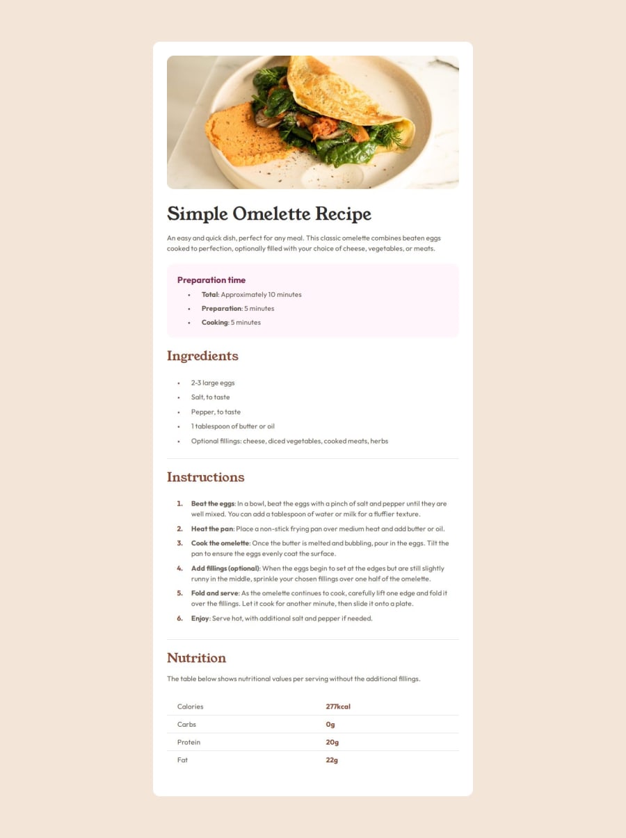


Design comparison
SolutionDesign

Solution retrospective
What are you most proud of, and what would you do differently next time?
-
I didn't have the Figma file, so I am pleased with matching as close as I could to the design.
-
The mobile reference image was different to the Desktop design, so I managed to tweak the code to match the mobile view
-
I used semantic html reasonably well, and made the table more accessible with the scope attribute.
I noticed these differences between the desktop and mobile design:
- No rounded corners on the article or image on mobile view
- Image takes up full width of its container on mobile view
- No margin (background colour not visible) on mobile
I solved that with media queries, but I wonder if there was a simpler or more dynamic way with clamp or calc or something...
- My ruleset organisation continues to feel messy or overly complex for a simple challenge. I know with practise I will work out a system and start to code and organise more efficiently.
- Using BEM is still a challenge, I can't figure out what to do when there are lots of repetitive styles in different blocks. Utility classes, or multiple selectors for a ruleset?
- How to achieve the mobile design differences without a media query?
Community feedback
Please log in to post a comment
Log in with GitHub
Join our Discord community
Join thousands of Frontend Mentor community members taking the challenges, sharing resources, helping each other, and chatting about all things front-end!
Join our Discord