Design comparison
SolutionDesign
Solution retrospective
What are you most proud of, and what would you do differently next time?
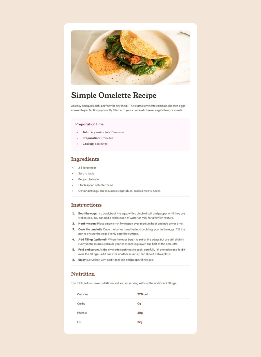
How everything turned out. Finally aligned everything as I wished.
What challenges did you encounter, and how did you overcome them?I had the problem of aligning the lists correctly and creating the space between the bullets/numbers and the text according to the design file. I admit I spent way too much time on that.
What specific areas of your project would you like help with?Regarding the bullets/numbering in lists. If there are any easier ways of styling them.
Please log in to post a comment
Log in with GitHubCommunity feedback
- @Pamlifa
I think its pretty darn good and close to the original design. Thumbs up!
Join our Discord community
Join thousands of Frontend Mentor community members taking the challenges, sharing resources, helping each other, and chatting about all things front-end!
Join our Discord
