Design comparison
SolutionDesign
Community feedback
- @DavidanKord10Posted 6 months ago
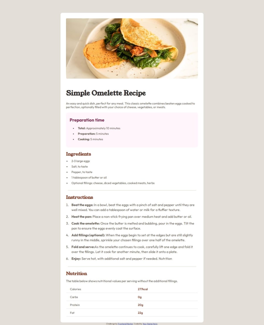
The colors are way off, and it's too small in height. For the color part there is a style file in the initial files that the site gave us, you can see that file for the color.
0
Please log in to post a comment
Log in with GitHubJoin our Discord community
Join thousands of Frontend Mentor community members taking the challenges, sharing resources, helping each other, and chatting about all things front-end!
Join our Discord
