Solution retrospective
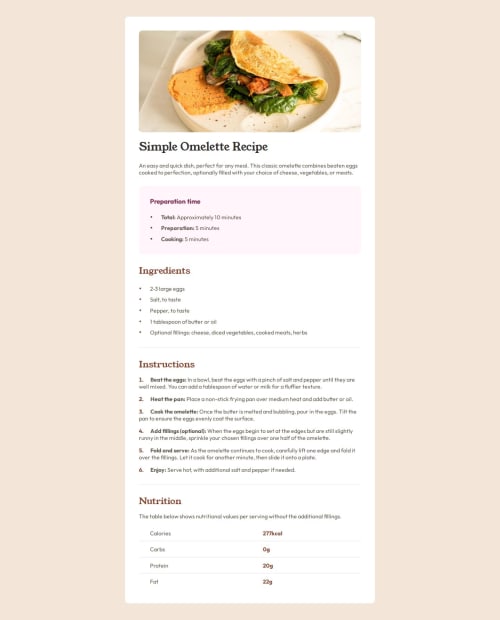
I was able to complete the project successfully. I am proud that I learned tons about lists and some pseudo selectors. The next time I ensure that list content, when longer than a single row, aligns with the start of the first row, rather than continuing from the bottom of the bullet point.
What challenges did you encounter, and how did you overcome them?I had problems with styling the bullet point. I needed to make it smaller, color differently and create some space from the list item. I overcame the challenge using two different methods. One was making the list style position inside and then putting text inside the list item span and then adding margin or padding to the span itself. The other method was getting rid of the default style, adding my personal bullet point with my own specifications using ::before selector. Finally, there was a serious problem with aligning the bullet point with the subsequent text because of differences in font sizes. So, because vertical alignment did not work, I made the position of the bullet point relative and then added top or bottom space according to my taste.
What specific areas of your project would you like help with?I would love some help on responsiveness of my website. Also, as I said before, I could not ensure that list content, when longer than a single row, aligns with the start of the first row, rather than continuing from the bottom of the bullet point. So, would be great if someone helped with that.
Please log in to post a comment
Log in with GitHubCommunity feedback
No feedback yet. Be the first to give feedback on N1Dovud's solution.
Join our Discord community
Join thousands of Frontend Mentor community members taking the challenges, sharing resources, helping each other, and chatting about all things front-end!
Join our Discord