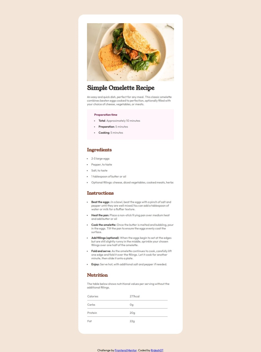
Design comparison
Solution retrospective
1] I was having hard time doing the last nutrition section the line below the data 2] even while designing for the mobile i was not able to set the width of image to full view , how should i do that ?
Community feedback
- @DandyHypePosted about 1 year ago
The problem with the image can be solved by removing the height and width of the img and in your @media for mobile add the negative margin equal to the padding of the parent, in your case margin: -1.5rem;
Marked as helpful2 - @KollerJacqPosted about 1 year ago
Hi, I was using the <hr> for every line in the code within the section. This way, it was easier to style. Also, even though there are surely better solutions for your problem with the image in the mobile version, this is how I've done it: @media (max-width: 375px) { .card-img-top { margin-top: 0; border-radius: 0; width: 375px; position: relative; right: 40px; } } You can also check out my code of this challenge if you want to!
Marked as helpful2
Please log in to post a comment
Log in with GitHubJoin our Discord community
Join thousands of Frontend Mentor community members taking the challenges, sharing resources, helping each other, and chatting about all things front-end!
Join our Discord
