Design comparison
Solution retrospective
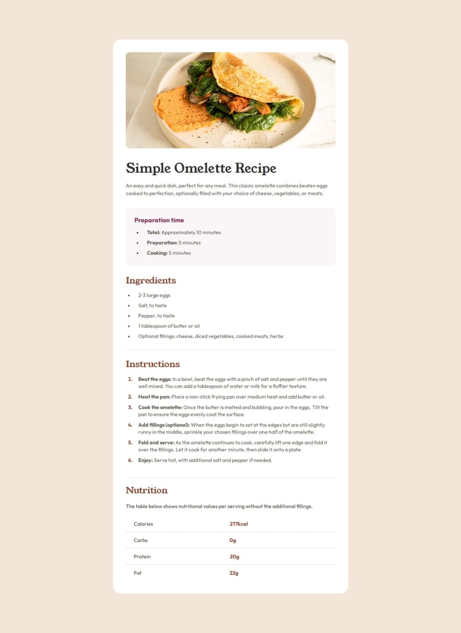
many. Especially the tables section. I even left this project unfinished because I couldn't match the boards to the original design. I did my best although I am not satisfied with the final result.
What specific areas of your project would you like help with?table section
Please log in to post a comment
Log in with GitHubCommunity feedback
- @MahmoodElsaayed
-
Hey, I also had some trouble with the table section. But the solution turned out to be pretty simple, at least in this case.
-
HTML has it's own semantic tags for tables
- <table>
- <tr> (table row)
- <th> (table header)
- <td> (table data).
-
Pieced together, they'll automatically give you a pretty close version to the desired layout and you'll only need to do some minimal styling to get it right.
// HTML <table> <tr> <th>Calories</th> <td>277kcal</td> </tr> <tr> <th>Carbs</th> <td>0g</td> </tr> <tr> <th>Protein</th> <td>20g</td> </tr> <tr> <th>Fat</th> <td>22g</td> </tr> </table> // CSS table { width: 100%; text-align: left; } table th, .nutrition table td { padding: 10px 30px; }-
This is way easier than manually aligning the items and also more accessible. But tbh with you, I wouldn't get too caught up on tables. You'll rarely need them and they can get complicated real fast. But on the off chance that you find yourself needing to use tables, MDN has a 2 part guide to tables.
-
Other than that, great work on your project! It looks great 👍😊
Marked as helpful -
- @maxkdavis
Overall, you did an amazing job matching your final solution to the design specs. Could (minor) things I noticed:
-
For the <ul> element, you can adjust the size of the bullet point with the ::marker pseudo-class and 'font-size' property. So you can do something like
li::marker { font-size: 12px; } -
It doesn't appear your project is mobile responsive. You can read more into Media Queries or leverage a CSS Library (i.e., Bootstrap) to add this.
Nice job and good luck with your continued coding journey!
Marked as helpful -
Join our Discord community
Join thousands of Frontend Mentor community members taking the challenges, sharing resources, helping each other, and chatting about all things front-end!
Join our Discord
