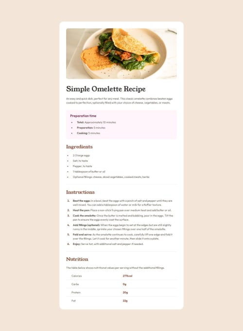
Recipe page using Vue

Solution retrospective
- I learned how to keep track of every detail in the Figma mockups.
- I made the page responsive by using fluid design and media queries.
- I also learned how to style lists and tables with CSS.
It was a challenge to keep track of every detail in the Figma mockups.
It was also tricky to understand the responsive design (how the page adapts on different screen sizes). I overcame this challenge by taking some time to understand the responsive design before I started coding. That helped me to make better decisions during the coding process.
I didn't know how to style the nutrition table when using the semantic table element.
That's why I built the table design from scratch. It was way easier for me at first.
However, I saw a good solution when giving feedback to someone's submission. From this solution, I learned how to implement the table by using the semantic table element.
(I updated my submission.)
Please log in to post a comment
Log in with GitHubCommunity feedback
No feedback yet. Be the first to give feedback on Micha Huhn's solution.
Join our Discord community
Join thousands of Frontend Mentor community members taking the challenges, sharing resources, helping each other, and chatting about all things front-end!
Join our Discord