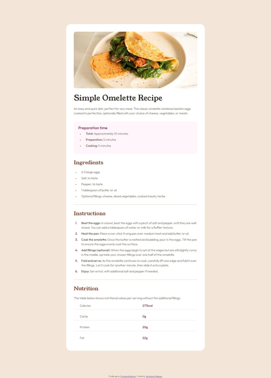
Recipe page using vanilla CSS (Flex, Clamp, Media queries)
Design comparison
Solution retrospective
The outside in incremental approach I am using is working really well. Instead of doing details and work here and there, I systematically start from the big all the way down to the small details.
Next time I'd like to try a mobile first approach.
What challenges did you encounter, and how did you overcome them?There were a lot of tricky parts in this one. From the use of custom markers for lists to the mixed use of clamp and media queries for mobile and the rest of the screen sizes. It required a lot of work to get everything pixel-perfect.
What specific areas of your project would you like help with?Is the use of clamp and media query correct? Is there an easier way to have the list decorators done, rather than customizing them? How well did I structure the CSS?
Community feedback
Please log in to post a comment
Log in with GitHubJoin our Discord community
Join thousands of Frontend Mentor community members taking the challenges, sharing resources, helping each other, and chatting about all things front-end!
Join our Discord
