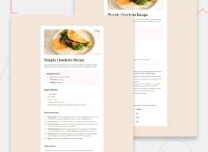
Design comparison
Solution retrospective
I think responsive design is kind of annoying
Community feedback
- @Mirjax2000Posted 8 months ago
Hi i checked your solution
on the first check i see that you did not use Young serif fonts for headings elements. Also your font sizes are different from the design. Maybe you think it is not so iportant, if contractor give you design to code by you, it needs to be pixel perfect. For example if you work for mcdonald, he gives you hex codes of their colors pallete, and if something is even little bit different, he will not pay you. It must be perfect at all circumstances.
also your last list item "nutrition -> fat" has bottom border. it is not in the design.
preparation list item list style type dots has wrong color.
And i see you made it by tailwind hosted form CDN. Good job. It is nice and looks easy. I tryed bootstrap, but i see tailwind is more precise. and what i see you solved that numbers from <ol> has different colors than text inside <li> element.
<li class="pl-3 font-bold text-[#94536f]"> and span child nas black text, nice one.good job. You already are master.
Marked as helpful0@Fikriwib12Posted 8 months ago@Mirjax2000 Hi, thank you for the feedback
First of all for young serif fonts I have tried using it through the google font link. But when I wrote the syntax font-['Young Serif'], the font in the title remained unchanged, so to make it look similar I used a serif font. After re-reading the tailwindcss documentation, I realized that I wrote the syntax incorrectly. To use font names with more than one word, I should add an underscore sign. For example, font-['Young_Serif']. I tried this and it worked. I will fix it for this font.
Then for the font size, I tried to follow the style guide, but after comparing it on destkop preview and mobile design, I felt that the font was not suitable, so I changed the font size. I didn't know that following the style guide is very important. Thank you for telling me that pixel perfect is very important, this is a new lesson for me.
Then for the bottom border under the last list item "nutrition -> fat", I didn't notice it either, thanks for pointing it out, I'll be more careful next time.
Thanks for the advice, bro. I'll be more careful next time. Apologies for any misunderstandings; my English isn't great🙏.
1@Mirjax2000Posted 8 months ago@Fikriwib12 no problem at all, My english is also very basic. But if we understand each other it will be great.
that pixel perfect and attention to the detail has higher value for you potencional employer. He see that you are better then the other and you have better chance to get hired.
Marked as helpful0
Please log in to post a comment
Log in with GitHubJoin our Discord community
Join thousands of Frontend Mentor community members taking the challenges, sharing resources, helping each other, and chatting about all things front-end!
Join our Discord
