Design comparison
Community feedback
- P@kaamiikPosted 6 months ago
سلام. من یکسری نکات رو داخل کد شما دیدم گفتم اگر اشاره کنم بد نباشه. کدتون خوانا و خیلی تمیزه و موارد مربوط به accessibility رو بنظرم خوب رعایت کردین. من با انگلیسی یکم دست و پا شکسته مینویسم که قاطی نباشه. اگر ایرادی داره ببخشید :)
-
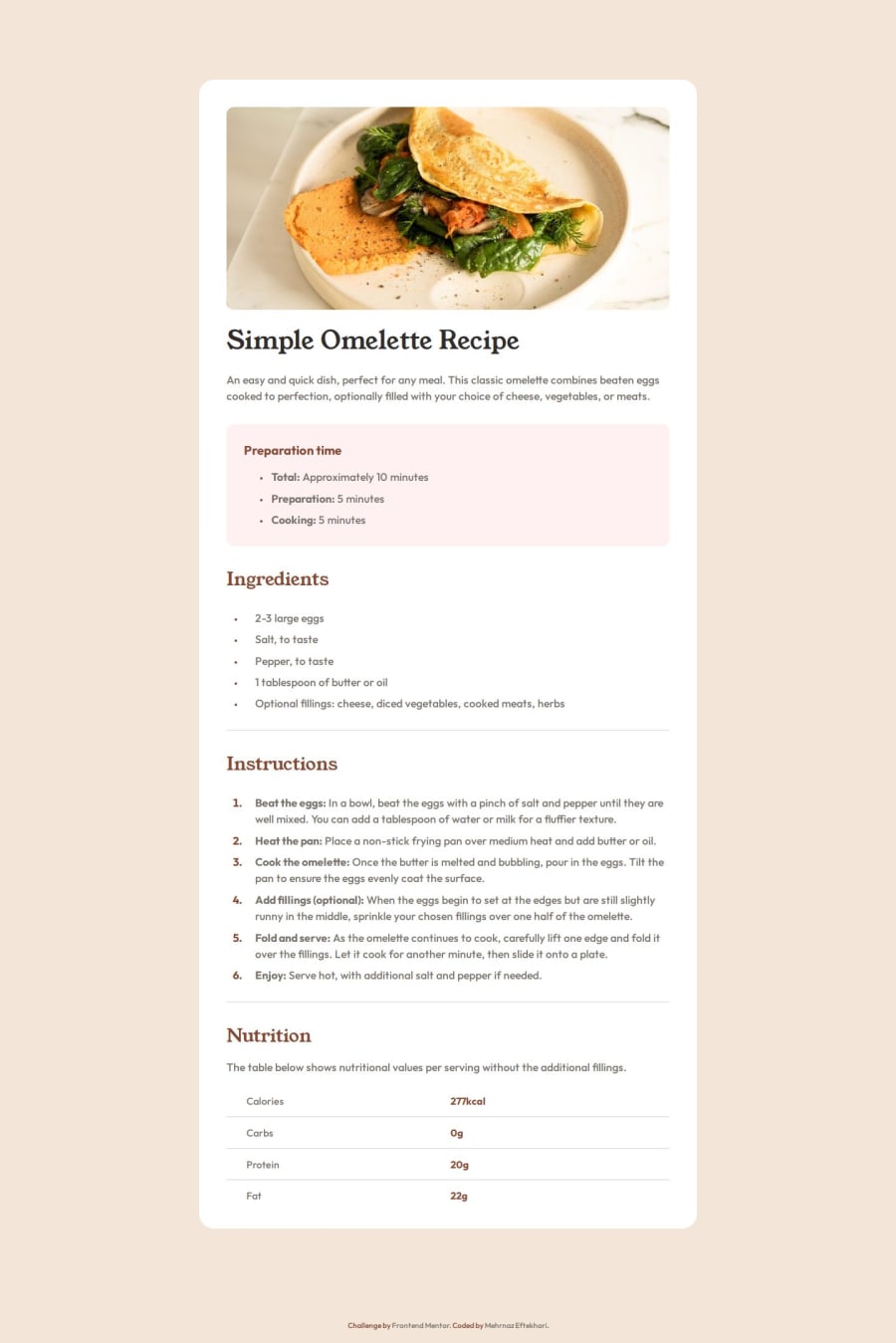
headertag is mostly use fornavitems and your logo. In this page all you need is amainandfooter. -
Maybe not very important but Your bullets inside the
lishould be a center aligned and also need a gap between the text and bullet. It's ok inside the Ingredients but not inside the Preparation time. I think you can useli::markerto style your bullets. -
One alternative for each horizontal line after each section is to use
hrtag. I think here is a good use case. -
When your page become narrower; I mean between 650px to 800px, you need to add a margin to your card container to have a distance from the edges.
امیدوارم در ادامه مسیر موفق باشی.
0@mehrnaz98Posted 5 months agoThanks for the feedback @kaamiik ! 🙏ممنون از نکات مفیدی که بهشون اشاره کردید
1 -
- P@tloyanPosted 6 months ago
Great work!
However, be careful with the bullet markers in the unordered list, as they are not properly centered. To my knowledge, this can't be easily fixed with native markers or Tailwind's default utilities. :)
0@mehrnaz98Posted 5 months agoThanks for the feedback @tloyan ! I'll try to fix that.
0
Please log in to post a comment
Log in with GitHubJoin our Discord community
Join thousands of Frontend Mentor community members taking the challenges, sharing resources, helping each other, and chatting about all things front-end!
Join our Discord
