

Design comparison

Solution retrospective
I had a lot of hard work trying to get as close to the design as posible, i couldn't match up all the details. Also i tried to keep the code organized, which toke me a lot of work too.
I would like to know if my code it's well presented, and if not, what can i do to get it better the next time? It's a funny mix between regular selectors and CSS BEM.
Also i would like feedback about the design details, i tried using Perfect Pixel but there are some things i couldn't get exactly equal.
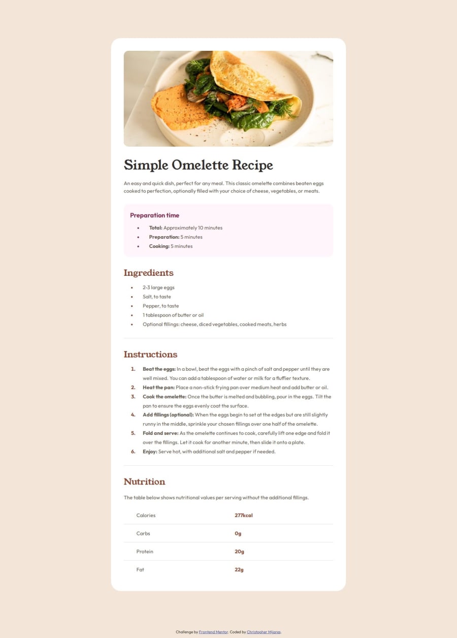
Finally, i know the Nutrition section has a table in it, but i used CSS Grid for it since i'm not familiar using table tags.
Thanks!!
Community feedback
- P@nitinrs95Posted about 1 month ago
Hello Chris,
Your design appears flawless, even with the use of pixel-perfect precision.
Just a quick suggestion: instead of using modifier classes (e.g., .entity) for bottom margins, try leveraging Flexbox with the gap property. It simplifies spacing and gives better control over layouts. Also, consider placing utility classes after the main class (e.g., class="instructions entry") and using more descriptive class names for clarity and maintainability.
Hope this helps! Still learning myself, but thought I’d share.
Marked as helpful1@Cemijares23Posted about 1 month ago@nitinrs95 Hey, thank you for commenting. Sure i find it helpful! I'll try to apply your suggestions from now
0

Please log in to post a comment
Log in with GitHubJoin our Discord community
Join thousands of Frontend Mentor community members taking the challenges, sharing resources, helping each other, and chatting about all things front-end!
Join our Discord