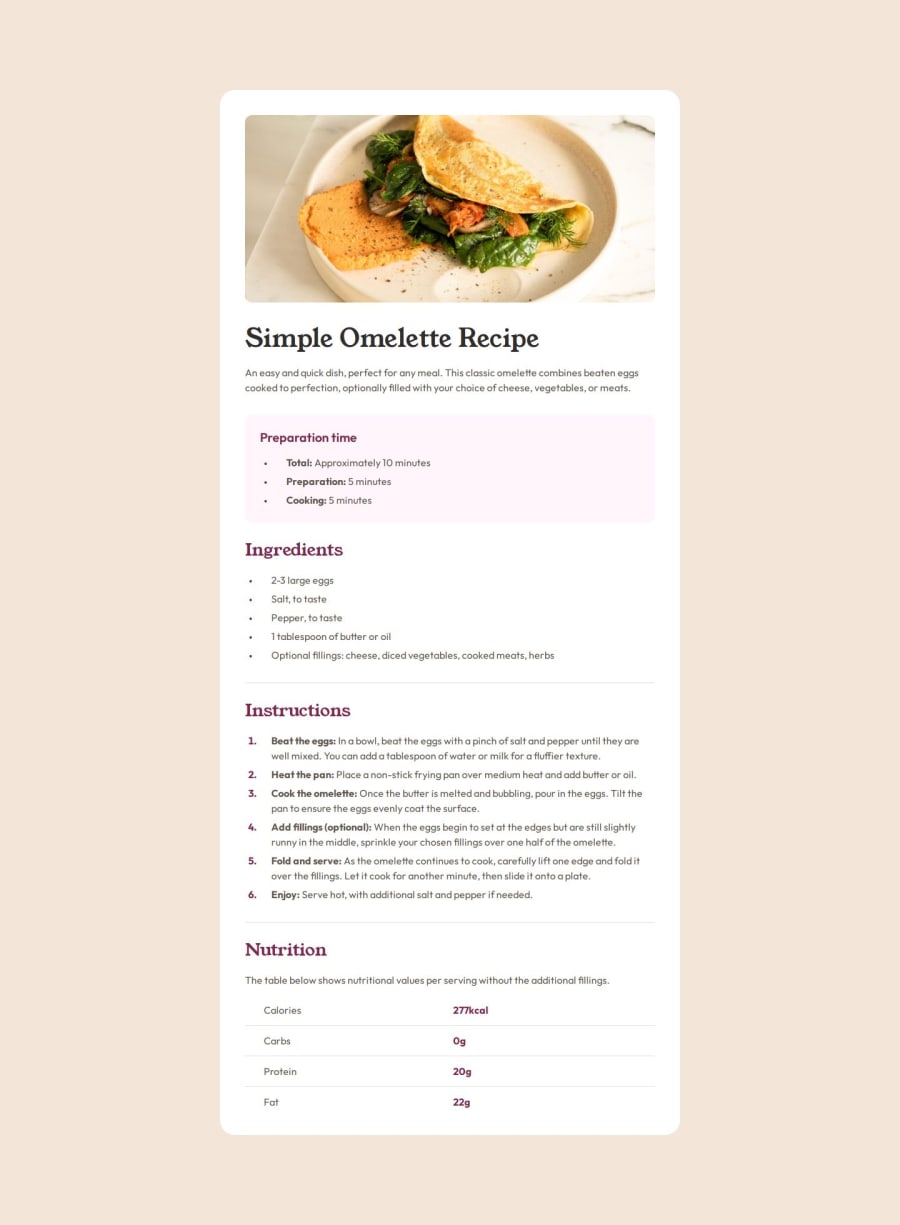
Design comparison
Solution retrospective
I'm proud of further refining my workflow to help stay organized. There was a lot of small detail tweaks required to come as close to the design as possible and my CSS would have been much more confusing to get around if I hadn't tried to keep it reasonably organized.
What challenges did you encounter, and how did you overcome them?I had quite a lot of difficulty with styling the table to look like the design. Particularly in getting the column padding and spacing to match the design closely.
What specific areas of your project would you like help with?How can I get the bullets to align vertically in the middle of the list item (as seen in the mobile design where the text is in two rows)? I was unable to find a solution that achieved this.
Please log in to post a comment
Log in with GitHubCommunity feedback
- P@salentipy
Looks good to me! Your code is SO neat; I love it! I did find one typo in there. It doesn't appear to be affecting anything, but I thought you would want to know. There is an extra semi-colon on line 77 after the word "block." Otherwise, again, it looks good to me! :)
Marked as helpful - @nickabate
If you were to turn your list items into flex containers (align items center), include a span element within that had the bullet point • inside and style them accordingly, you can remove the default bullet point and style it as it's own element. This can effectively let the bullet point always be aligned to the center of the text, no matter how many rows it contains. Hope that helps!
Marked as helpful
Join our Discord community
Join thousands of Frontend Mentor community members taking the challenges, sharing resources, helping each other, and chatting about all things front-end!
Join our Discord
