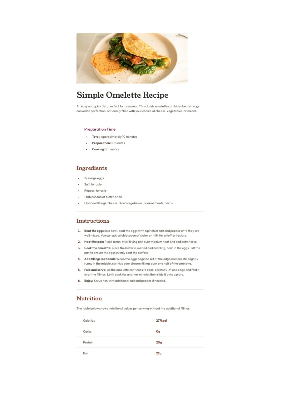
Design comparison
SolutionDesign
Solution retrospective
What are you most proud of, and what would you do differently next time?
I am most proud of how efficient I am getting at figuring out the solutions to problems when I get stuck.
What challenges did you encounter, and how did you overcome them?The image in this project kept overflowing off the page and I overcame this be removing the fixed height I had set for body. ( height: 100vh to min-height: 100vh)
What is the best way to measure distances on my browser window? This would be helpful as I would be able to compare these distances with the distances in the design file.
Please log in to post a comment
Log in with GitHubCommunity feedback
No feedback yet. Be the first to give feedback on hopefulobject's solution.
Join our Discord community
Join thousands of Frontend Mentor community members taking the challenges, sharing resources, helping each other, and chatting about all things front-end!
Join our Discord
