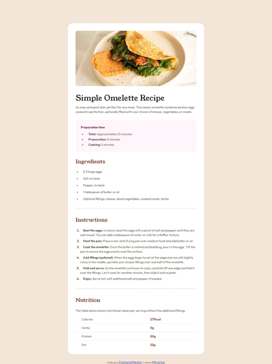
Design comparison
SolutionDesign
Solution retrospective
What are you most proud of, and what would you do differently next time?
What I would do differently is to look twice at the elements I could use or need.
What challenges did you encounter, and how did you overcome them?The table was a bit of a headache, but luckily the documentation/online resources were comprehensive. Also setting the lists' boundaries was pretty challenging.
What specific areas of your project would you like help with?How to structure the CSS code in a more efficient manner. I feel like I could've done better there.
Community feedback
- @BozJRPosted 5 months ago
This code and outcome looks great! , only thing i can really see is that the paragraphs in the Instructions section don't flow like they do in the design.
1
Please log in to post a comment
Log in with GitHubJoin our Discord community
Join thousands of Frontend Mentor community members taking the challenges, sharing resources, helping each other, and chatting about all things front-end!
Join our Discord
