Not Found
Not Found
Not Found
Not Found
Not Found
Not Found
Not Found
Not Found
Not Found
Not Found
Not Found
Not Found
Not Found
Not Found
Not Found
Not Found
Not Found
Not Found
Not Found
Not Found

Submitted

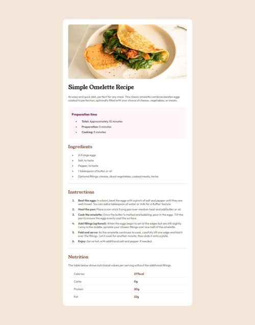
Recipe page using HTML/CSS

P

@Erika-codes

Desktop design screenshot for the Recipe page coding challenge

This is a solution for...

  • HTML
  • CSS
1newbie
View challenge

Design comparison


SolutionDesign

Solution retrospective


What are you most proud of, and what would you do differently next time?

I am most proud of being determined to find the correct solution.

What challenges did you encounter, and how did you overcome them?

The challenge I encountered was trying to remove the last border from the table. I tried using the last-child pseudo class, but it was not resulting in the desired style. Before committing, I made one last attempt to remove the border, and it worked! I just needed to add td to the end. That is what I was missing.

What specific areas of your project would you like help with?

The specific area of my project that I would like help with is, I noticed there is a split in the borders in my table. I am not sure why this occurred or how I can fix it.

Community feedback

@SvitlanaSuslenkova

Posted

Have you tried to add border to <tr>, not to <td>?

0
P
Steven Stroud 4,140

@Stroudy

Posted

Amazing job with this! You’re making fantastic progress. Here are some small tweaks that might take your solution to the next level…

  • I can not see the issue but I believe it to be default styling the element, Use a full reset to solve the issue,

  • If you applied a full reset you would have avoided this, Using full modern CSS reset is beneficial because it removes default browser styling, creating a consistent starting point for your design across all browsers. It helps avoid unexpected layout issues and makes your styles more predictable, ensuring a uniform appearance on different devices and platforms, check out this site for a Full modern reset

  • Using max-width: 100% or min-width: 100% is more responsive than just width: 100% because they allow elements to adjust better to different screen sizes. To learn more, check out this article: responsive-meaning.

  • Developers should avoid using pixels (px) because they are a fixed size and don't scale well on different devices. Instead, use rem or em, which are relative units that adjust based on user settings, making your design more flexible, responsive, and accessible. For more information check out this, Why font-size must NEVER be in pixels or this video by Kevin Powell CSS em and rem explained.- Another great resource for px to rem converter.

  • This does not matter that much at this stage but something to be mindful of for SEO(Search Engine Optimisation), <meta> description tag missing that helps search engine determine what the page is about, Something like this <meta name="description" content="description goes here" />

  • Using a naming convention like BEM (Block, Element, Modifier) is beneficial because it makes your CSS more organized, readable, and easier to maintain. BEM helps you clearly understand the purpose of each class, avoid naming conflicts, and create reusable components, leading to a more scalable codebase. For more details BEM,

You’re doing fantastic! I hope these tips help you as you continue your coding journey. Stay curious and keep experimenting—every challenge is an opportunity to learn. Have fun, and keep coding with confidence! 🌟

0

Please log in to post a comment

Log in with GitHub
Discord logo

Join our Discord community

Join thousands of Frontend Mentor community members taking the challenges, sharing resources, helping each other, and chatting about all things front-end!

Join our Discord