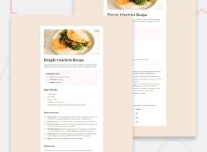
Design comparison
Community feedback
- @defPhisyPosted 9 months ago
Hi Emir, great work the card is very close to the design, looks very good.
-
Does the solution include semantic HTML? Yes, good use of lists and table. Try to use more semantic elements like section and article instead of divs. That concerns me too 😁.
-
Is it accessible, and what improvements could be made? I am too inexperienced to give you tips here. From my point it is ok, since there is no interaction on the site. Beside that you could improve your alt text on the omlette picture. "img" is not very descriptive.
-
Does the layout look good on a range of screen sizes? Desktop size looking great, except the white bar on the bottom and the missing margin on top of the card. When you have a look on the design files the mobile version should have a different layout. you can work with media queries to solve that. You should consider to use less px an more relative measures lite rem to ensure a responsive design.
-
Is the code well-structured, readable, and reusable? Yes. Is there a reason why you use <span> elements on all links?
-
Does the solution differ considerably from the design? The card itself looks very good. You should improve the padding on the body to give some margin at the top and bottom of the card. The background also needs to be continuous. You do not want the white bar on the bottom.
Keep up the good work. 👍
0 -
Please log in to post a comment
Log in with GitHubJoin our Discord community
Join thousands of Frontend Mentor community members taking the challenges, sharing resources, helping each other, and chatting about all things front-end!
Join our Discord
