Design comparison
Solution retrospective
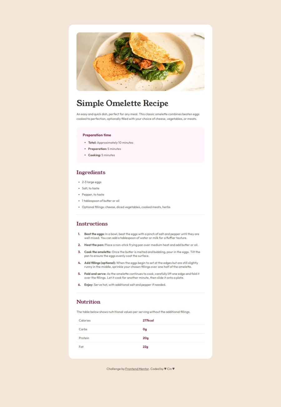
I think it looks pretty much like the provided design
What challenges did you encounter, and how did you overcome them?spacings between elements
What specific areas of your project would you like help with?Community feedback
- @CelineJamesPosted 8 months ago
Perfect!!! i must commend your work, welldone. did you have access to the figma file?
0@cintiavicPosted 8 months agoThank you very much @Kaytorah! I didn't have access to the figma file. Instead, I opened the provided jpg in Figma and created it from scratch using the image as a bottom layer serving as a guide. It was tough but it helped a lot in matching the styles as much as possible. Not the tidiest way to work... but if it helps: https://www.figma.com/design/CDM2PCt2kcAlp5MFwbxXIy/Untitled?node-id=0-1&t=mS5qhk4pIbuTmIqt-1
0
Please log in to post a comment
Log in with GitHubJoin our Discord community
Join thousands of Frontend Mentor community members taking the challenges, sharing resources, helping each other, and chatting about all things front-end!
Join our Discord
