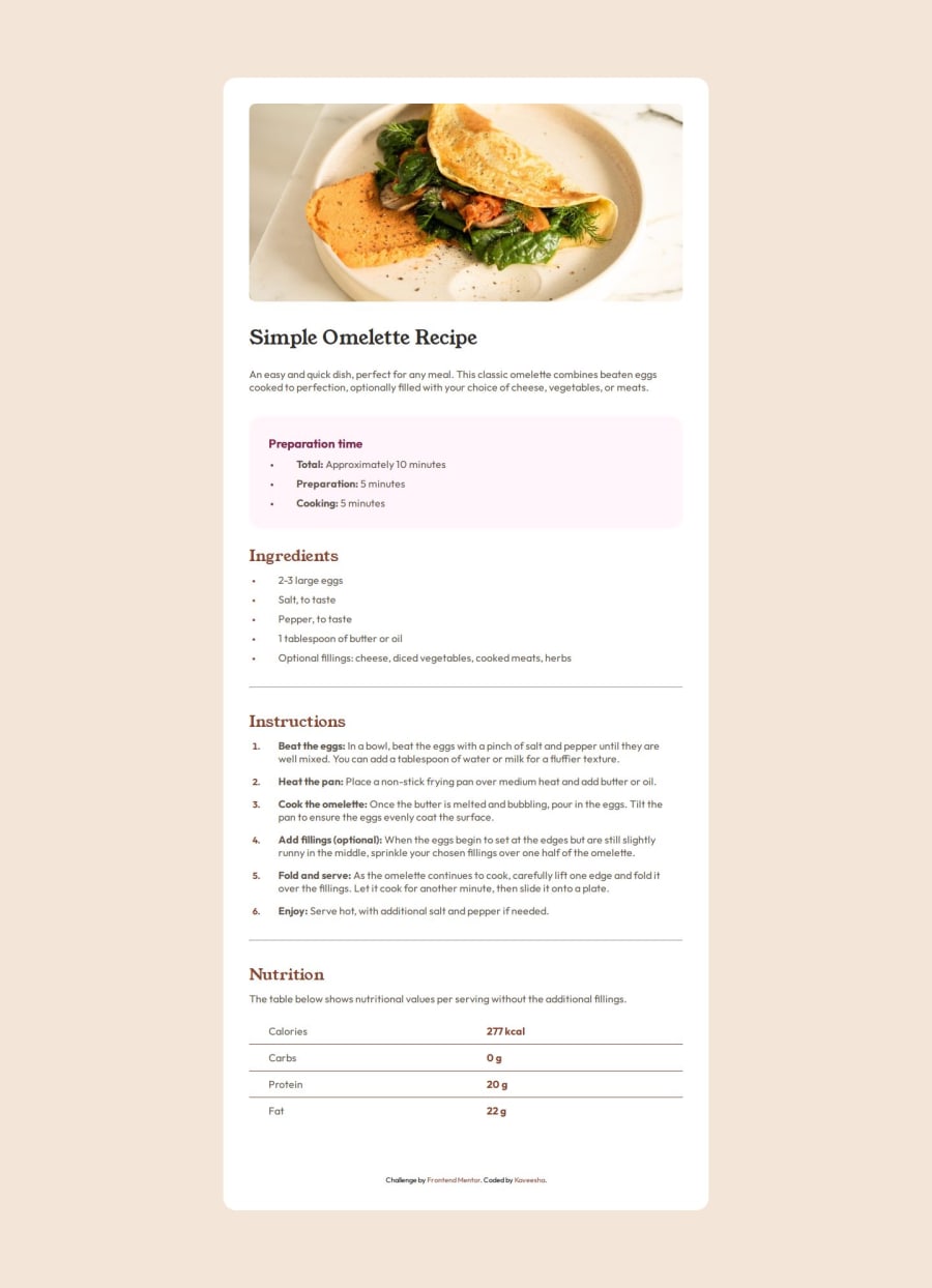
Design comparison
Solution retrospective
I'm super with the end result. Designing this recipe page was super fun and im proud of myself for designing it in a short period of time using the past experiences of frontend mentor challenges.
What challenges did you encounter, and how did you overcome them?I had a little trouble with the list styling, especially the spacing between the list type and the text spacing. i learned new css list properties such as list-style-position. I overcame this problem by looking up how to add spacing between list style type and the text
I would like to know how my solution is in general considering the fact that i designed everything without using the figma design file (since im not a pro member i didnt have access to it) and had to eyeball all the measurements
Community feedback
Please log in to post a comment
Log in with GitHubJoin our Discord community
Join thousands of Frontend Mentor community members taking the challenges, sharing resources, helping each other, and chatting about all things front-end!
Join our Discord
