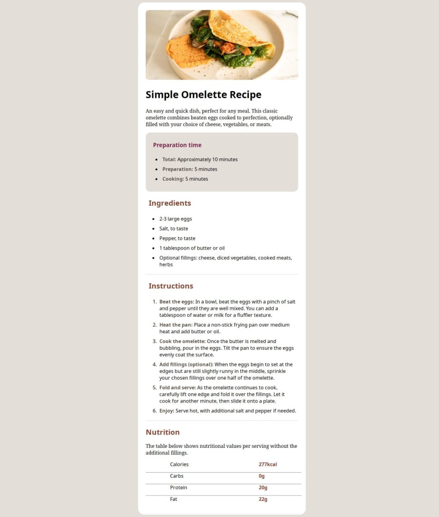
Design comparison
Solution retrospective
I am proud of how I learnt how to use html tables and format them with css
What challenges did you encounter, and how did you overcome them?I had a challenge creating custom borders for individual rows in a table but I overcame through figuring it out with one of my friends Akay who helped a lot especially when he showed me some stuff about border collapse.
What specific areas of your project would you like help with?My problem was changing the font this I haven't even done as of first upload because I still find it hard somewhat to get the concept of how it all works and implementing it.
Community feedback
- @gmagnenatPosted 6 months ago
Hi, congrats on completing this challenge! 🎉
I checked your repo and can give you some help to improve your solution.
At first, I thought your live url was broken because I was using my phone. The problem here, you have a fixed width of 1440 pixels on the body. This will apply for the small screen too and makes the website not responsive.
- You should not give a define width to the body and leave it to the browser.
- You should add a modern CSS reset to all your projects. It will help you with a clean starter point for writing your custom CSS. This is a good one Modern CSS Rest.
There's an easy trick to center your content using flexbox on your body.
body { min-height: 100vh; display: flex; flex-direction: column; justify-content: center; /* vertical alignement */ align-items: center; /* horizontal alignement */ }
If you want you can read more about centering "divs" here and learn new tricks Center a div
On your container you are using a fixed width of 500px.
You should use a max-width instead so the container can shrink on smaller screen and also you should use relative units for this.There's a lot of information here on how to set fonts. Maybe you can find your answer? Font-family on MDN. There is a confusion in your folder and file structure. You have two style.css files. One in the css folder and one in the assets/fonts folder. In your HTML you are calling the one in the css folder but in this one you are not importing the fonts. This may help solve your font issue.
general advice: never use pixel for font sizes and everything related to fonts. This is an accessibility matter. You have to respect the user preferences. Setting fonts in pixel force the text to be always in one size and ignore user preferences. You can read about this in this great article Why font-size must NEVER be in pixels.
I hope you find my comments helpful for improving your solution and your future challenges. There are other elements to comment on but I think that's already quite some content to digest.
Don't hesitate to reach out if you have any questions.
Happy coding !
Marked as helpful1@Michael-mikeojjPosted 5 months agoI am still having trouble with changing these fonts I don't understand it at all@gmagnenat
0 - @grace-snowPosted 6 months ago
Hi, there are quite a few things to learn from this and you'll need to refactor it before moving on.
- All content should be contained within landmarks. This design only has main page content so everything should be within a
main
landmark. Every page you do must always have one main. - Read the excellent post(s) in the resources channel on discord about how and when to write alt text on images. Alt shouldn't include words like "image" or "picture" because it's already an image role. They are meant to describe the image, express the same content and purpose as the meaningful image expresses.
- Be careful not to capitalise tags in html. It's
<p>
not<P>
. - You are using the deprecated
b
tag that is actually meaningless for hold text, when you should be usingstrong
which is a meaningful tag. It means "bold emphasis". - The table is missing it's header cells. It is essential to mark up header cells as
th
and content cells astd
. As these header cells are row headers (not column headers as in most tables) it is also important to use thescope
attribute on the header cells, set to "row" so it is clear they are acting as a header for their table row. I recommend you read up mdn docs on any element you need in a challenge when you encounter one's you're less familiar with like tables. - Link fonts in the html head. Google fonts will give you all the code you need. Just go,to the fonts, choose the specific families and weights you need then paste thir provided code in as instructed.
- Get into the habit of including a full modern css reset at the start of the styles in every project. Andy Bell or Josh Comeau both have good ones you can look up and use. You will need this in every project.
- Never limit the width of the body! Especially not in px.
- Give the content (the white box) a max width not width, and make sure this is in rem so it scales correctly for all users including those who have a different default text size setting. This solution is not responsive because you've used explicit widths and paddings instead of a single max width on the container and kept to small paddings.
- Generally, you will only want to use element selectors at the start of a larger / real project to set sensible default styles. For component styling, place classes directly on what you want to style in the html, then use those classes as selectors in CSS. It probably matters less in this challenge as it's mostly basis text content but I think it's worth mentioning so you don't get into the habit of styling elements all the time.
- Make sure you understand the difference between padding and margin. The container should have padding, everything within it should have vertical margins. I am very surprised to see a h3 style with padding applied in here.
- The table layout must not be created using huge paddings or any other unit. The table should be width 100%. Td and th can be 50% if it needs equal columns or a different percentage make up if needed depending on the design. Keep paddings small!
1@gmagnenatPosted 6 months ago@grace-snow I was writing at the same time on this one 🤦. Let me know if my comment help in any way or if I can delete it.
0@Michael-mikeojjPosted 5 months ago@gmagnenat your comment was helpful but I applied some of the things please check if there is anything left I haven't done
0@Michael-mikeojjPosted 5 months agoI have meade some changes please check if I have left anything out@grace-snow
0@Michael-mikeojjPosted 5 months agoI taught my land mark is already there?@grace-snow
0@gmagnenatPosted 5 months agoHey @Michael-mikeojj I quickly checked the repo and the url on mobile. The width isn’t right on phone it should be full width. For the rest I really recommend going one by one on every points mentioned by Grace. The first point is missing from your code so I didn’t check much further yet. Good luck !
Marked as helpful0@Michael-mikeojjPosted 5 months agoI didn't really get what she meant on that first one I just started last months and some of the terminologies I don't understand at all what did she mean by landmark@gmagnenat
0@grace-snowPosted 5 months ago@Michael-mikeojj I mean the
main
element that you should have on every page. Everything in this design goes inside main, no other landmarks are needed. When you’re not sure of a term look it up on MDN. Look up landmarks and it will explain them, then look up main which will be one of the ones it includes.Everything looks tiny when I preview on my phone but I’m not sure why when I’m away from my computer so can’t check it properly
0 - All content should be contained within landmarks. This design only has main page content so everything should be within a
Please log in to post a comment
Log in with GitHubJoin our Discord community
Join thousands of Frontend Mentor community members taking the challenges, sharing resources, helping each other, and chatting about all things front-end!
Join our Discord