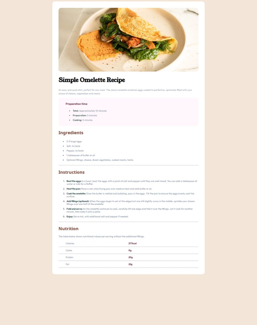
Design comparison
Solution retrospective
It is my first time, that I was building a mini-project with HTML and CSS, so I am proud, that I hit that first milestone. Things I would like to do differently next time: -Learn more about Figma, so I can better plan my site -Lean more about measurement units, so I can work in a more scalable manner -Use Flexbox
What challenges did you encounter, and how did you overcome them?-I spent most time to wrap my head around grits and different ways they can be build depending on the need.
Community feedback
- @pjtetedePosted about 2 months ago
Welldone, this is a nice one, and congrats on your milestone. You can only get better from here.
I noticed that you mentioned wanting to learn more about Figma:
- This Scrimba crash course can help you with it.
- This article by Matt Studdert here on Frontend Mentor is also great.
I love the fact that you tried using grids even though it wasn't easy for you, that how one really learns and grows. The following might help when it come to grid:
I hope this resources would be helpful on your journey towards greatness.👋🏽👋🏽👋🏽
Marked as helpful0@mr-sv3nPosted about 2 months ago@pjtetede Thank you so much for sharing! I will look into all of these resources!
0 - @StroudyPosted about 2 months ago
Exceptional work! You’re showing great skill here. I’ve got a couple of minor suggestions that could make this stand out even more…
- Your heading elements
<h1><h3><h2>
, Heading elements should be in sequentially-descending order (e.g.,<h1>
,<h2>
,<h3>
) to create a clear content structure, improving accessibility and SEO. Skipping levels or using them out of order can confuse screen readers, affect search engine rankings, and make your content harder to understand.
<h1>Simple Omelette Recipe</h1> <h3>Preparation time</h3>
-
For future project, You could download and host your own fonts using
@font-face
improves website performance by reducing external requests, provides more control over font usage, ensures consistency across browsers, enhances offline availability, and avoids potential issues if third-party font services become unavailable. Place to get .woff2 fonts -
I think you can benefit from using a naming convention like BEM (Block, Element, Modifier) is beneficial because it makes your CSS more organized, readable, and easier to maintain. BEM helps you clearly understand the purpose of each class, avoid naming conflicts, and create reusable components, leading to a more scalable codebase. For more details BEM,
I hope you’re finding this guidance useful! Keep refining your skills and tackling new challenges with confidence. You’re making great progress—stay motivated and keep coding with enthusiasm! 💻
0@mr-sv3nPosted about 2 months ago@Stroudy Thank you so much. I will look into BEM, hosting my own fonts and keep the heading sequencing in mind. I appreciate the feedback!
1@StroudyPosted about 2 months agoHey @mr-sv3n, Hope it was helpful, Just some things to be mindful of, You did great! You got this bro!
0 - Your heading elements
Please log in to post a comment
Log in with GitHubJoin our Discord community
Join thousands of Frontend Mentor community members taking the challenges, sharing resources, helping each other, and chatting about all things front-end!
Join our Discord