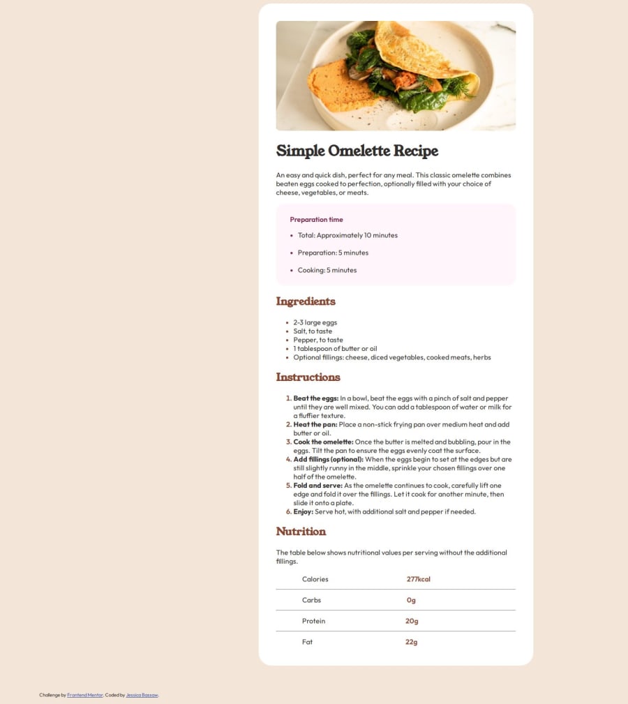


Design comparison

Solution retrospective
I am proud of myself for not giving up. It was a bit tough with regards to position and making sure the width and height etc were as close as possible. As to what I will do differently, I think I will edit my solution once I figure out what to do better. I am still learning so hopefully, there might come a time when I will provide a solution with ease.
What challenges did you encounter, and how did you overcome them?I was getting a bit confused about how it looked. When I previewed it on my live server, it looked different than when I opened it directly from the folder on my computer. Probably something I have to fix or figure out. I didn't make it responsive as I have yet to learn that. I couldn't also figure out how to put the space between the list number or bullet point and the content.
What specific areas of your project would you like help with?I would like to know what I can do differently to improve the solution. How can I set a height and width that changes relative to the dimension of the web browser? I would also like to know some possible reasons why the live server will show you something different when you open it in the browser than when you open it from the folder on the laptop.
Community feedback
- P@danielmrz-devPosted 9 months ago
Hello there!
Congrats on completing the challenge! ✅
Your solution looks great!
I have a suggestion for improvement:
📌 Think about using
<main>to wrap your main content instead of<div>.Imagine
<div>and<span>in HTML as basic containers. They're good for holding stuff, but they don't tell us much about what's inside or its purpose on the webpage.This change might not have impact on how your page looks, but it'll make your HTML code clearer and help with SEO and accessibility.
Hope that's helpful!
Keep up the great work!
Marked as helpful0@JessB74Posted 9 months ago@danielmrz-dev Thank you for your feedback. I will apply your suggestion
1 - @DylandeBruijnPosted 9 months ago
@JessB74
Hiya! 👋
Congratulations on your solution, it looks very close to the design! I can tell you put a lot of effort into it. I like that you tried to experiment and are willing to do better, it's a great mindset to have. Sadly I don't know why your solution looks different between viewing it on your live server and locally, maybe you could provide screenshots to compare.
Things I like about your solution 🎉
- Use of semantic HTML elements
- Clear descriptive CSS classes
Things you could improve ✍️
- At the moment your
bodyhas overflow issues, which means that the content in thebodyflows out of the dimensions that are set on thebody. This is due toposition: absoluteand thetop,leftandrightvalues. I'll show you a different approach which will make things much easier for you using a layout tool in CSS called Flexbox:
body {
    font-family: "Outfit", sans-serif;
    color: hsl(24, 5%, 18%);
    font-size: 16px;
    background-color: hsl(30, 54%, 90%);
    min-height: 100vh;
    display: flex;
    justify-content: center;
}
Try comparing the styles on your
bodyto the ones I provided. I also removed the<br>and<footer>you had so you have to do that too to see the results.If you haven't touched Flexbox yet it might be a lot to take in but taking the time to learn it will definitely pay off! I recommend this great guide if you have time to read.
-
Try styling elements more using classes than ID's.
-
Try using CSS variables to make your values more reusable.
-
Try using relative CSS units like
remandemto make your text more scalable.
I hope you find my feedback valuable, and I would appreciate it greatly if you could mark my comment as helpful if it was! 🌟
Let me know if you have more questions and I'll do my best to answer them. 🙋♂️
Happy coding! 😎
Marked as helpful0@JessB74Posted 9 months ago@DylandeBruijn Thanks a lot for your feedback. I will apply your suggestion to make the necessary changes
1


Please log in to post a comment
Log in with GitHubJoin our Discord community
Join thousands of Frontend Mentor community members taking the challenges, sharing resources, helping each other, and chatting about all things front-end!
Join our Discord