Design comparison
SolutionDesign
Community feedback
- @Sumta4realPosted 8 months ago
Well done! I can't seem to access your code, so I might not be as specific in my suggestions as I would have wanted. Below are my observations
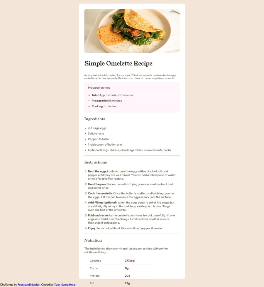
- Your content is not vertically aligned, you can try adding margin-top and bottom as 8% each to the div housing all your contents.
- Your ordered list marker should be bold. Add font-weight as bold. Use the ::marker pseudo-code
- the heading of each section should be in brown color not black. You can assign the same class to all the headings and style all using the class name in your css file 4.Also consider using section tag instead of div tags
- Also don't assign height to the div housing all your contents.
- Consider putting your attrition class in a footer tag and styling it as a fixed footer. You can do this by setting position as fixed and bottom property as 0 and set the text-align property as center.
I hope you find this helpful and I wish you the very best
0
Please log in to post a comment
Log in with GitHubJoin our Discord community
Join thousands of Frontend Mentor community members taking the challenges, sharing resources, helping each other, and chatting about all things front-end!
Join our Discord
