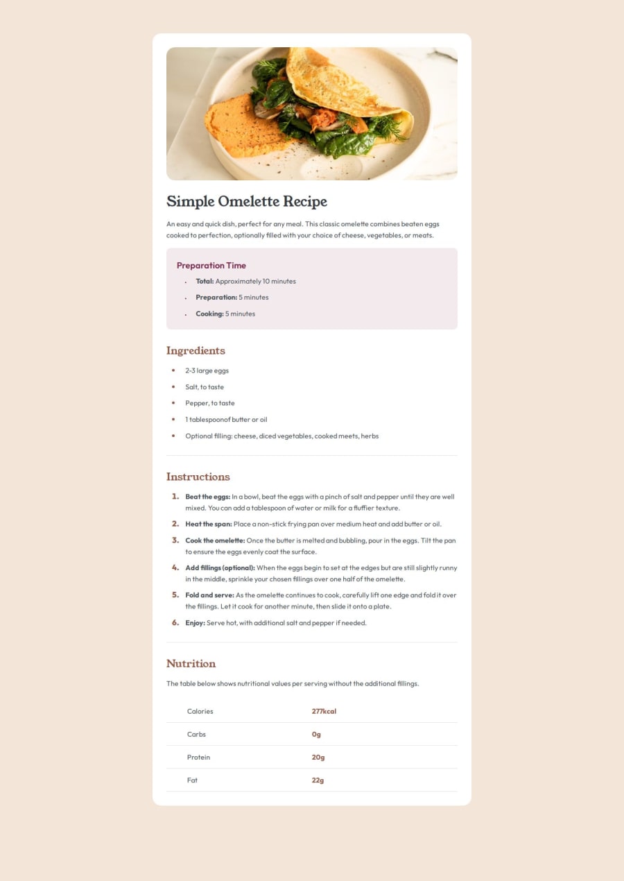
Design comparison
SolutionDesign
Solution retrospective
What are you most proud of, and what would you do differently next time?
In my opinion, I think I was able to create a nice solution pretty close to the design that was provided. So overall, I am proud and satisfied with this challenge.
What challenges did you encounter, and how did you overcome them?I didn't find any part of this project too difficult. Maybe the responsiveness part could be a bitter, but in general I think this is a successful project.
What specific areas of your project would you like help with?I would be grateful if someone could provide some general critiques about the code organization, semantic HTML and some opinions on how the solution looks.
Community feedback
Please log in to post a comment
Log in with GitHubJoin our Discord community
Join thousands of Frontend Mentor community members taking the challenges, sharing resources, helping each other, and chatting about all things front-end!
Join our Discord
