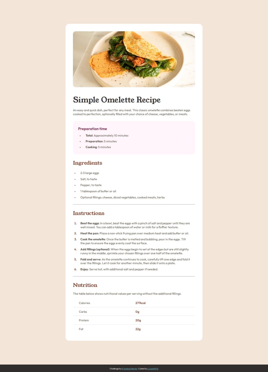
Design comparison
Solution retrospective
Any ideas as to why the number 1 in the instructions section looks different from the original design? Both of the provided fonts didn't look right.
Community feedback
- @BANKOLEDOPosted 9 months ago
This a very nice solution, its well structured and the design is cool, did you utilize the figma file or the starter file?
0@LucasNgTgPosted 9 months ago@BANKOLEDO Hello there! Thank you, I'm glad you liked it. I used the starter file, kept taking a bunch of screenshots, importing them on GIMP and comparing to the original.
0
Please log in to post a comment
Log in with GitHubJoin our Discord community
Join thousands of Frontend Mentor community members taking the challenges, sharing resources, helping each other, and chatting about all things front-end!
Join our Discord
