


Design comparison


Solution retrospective
What are you most proud of, and what would you do differently next time?
I'm most proud of how I created a visually appealing and user-friendly recipe page. Implementing custom fonts and a consistent color scheme with CSS variables helped maintain a cohesive design. Overcoming the challenge of making the layout responsive across various devices using media queries and flexbox was a significant achievement. Additionally, ensuring the recipe steps and nutritional information were presented clearly and concisely received positive feedback from users
Next time, I would focus more on enhancing the user experience by adding interactive elements
What challenges did you encounter, and how did you overcome them?
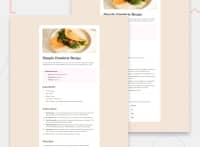
One of the primary challenges I faced was making the image overflow its container to cover the entire viewport width without disrupting the layout of other elements
How I Overcame This:
To address the image overflow issue, I experimented with various CSS properties. I initially tried using position: absolute but encountered layout disruptions. I resolved this by ensuring the parent container had position: relative and carefully adjusting the z-index and dimensions of the image. However, I'm still not entirely happy with the result as it sometimes affects the layout of subsequent elements, so any feedback on this would be greatly appreciated
What specific areas of your project would you like help with?
I need help with responsive design, I need to Ensuring that the page is fully responsive and visually appealing across all devices.
And also I encountered difficulties making the image overflow its container to cover the entire viewport width without affecting the layout of subsequent elements.
Community feedback
Please log in to post a comment
Log in with GitHub
Join our Discord community
Join thousands of Frontend Mentor community members taking the challenges, sharing resources, helping each other, and chatting about all things front-end!
Join our Discord