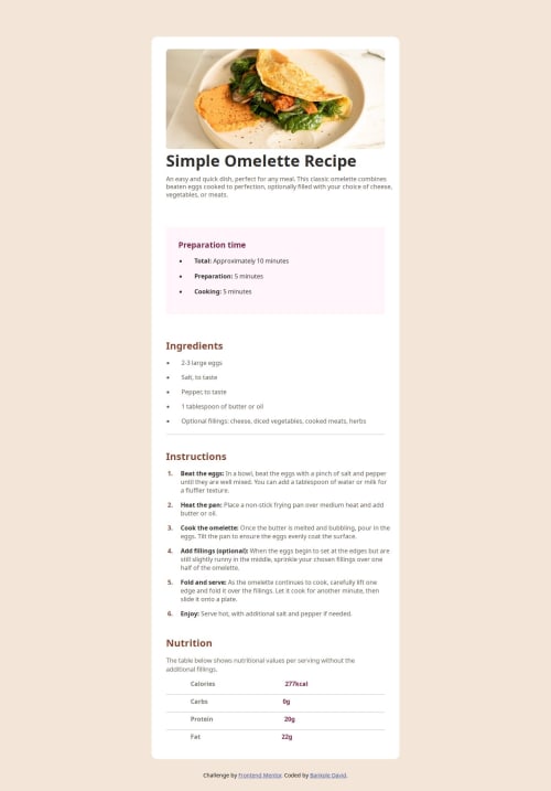
Submitted over 1 year agoA solution to the Recipe page challenge
Recipe Page Using HTML and CSS
@BANKOLEDO

Solution retrospective
What are you most proud of, and what would you do differently next time?
I learnt a lot, it was a tough challenge but i did it
What challenges did you encounter, and how did you overcome them?when i tried to give a margin between list markers and its text, i overcomed it by utilizing pseudo selectors ::before and flex properties
What specific areas of your project would you like help with?I am open to corrections
Code
Loading...
Please log in to post a comment
Log in with GitHubCommunity feedback
No feedback yet. Be the first to give feedback on Bankole David's solution.
Join our Discord community
Join thousands of Frontend Mentor community members taking the challenges, sharing resources, helping each other, and chatting about all things front-end!
Join our Discord