Recipe page using HTML and CSS

Solution retrospective
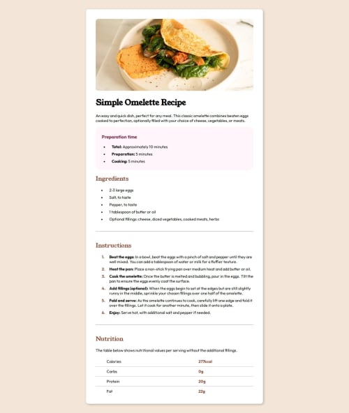
I had some trouble to discover how would I do the part below the ''Nutrition'' subtitle. It looked like it was using an tag but I found out that it wasn't, so after some moments thinking I figured out that it was a table with a border below each row.
The part where I had to change the color and weight of the numbers in the within the ''Instructions'' subtitle without changing the color and weight of the text following it was also a challenge. After some research, I managed to do it. Just needed to created an and substitute the bullet points with the numbers.
The last challenge was making the website responsive for 375px screens. I didn't quite manage to make it identical to what it was supposed to look like in the pre-estabilished design. I could create another HTML and CSS to make it look identical but that wasn't the objective of the challenge. It was to make the website responsive, but I couldn't do it.
Please log in to post a comment
Log in with GitHubCommunity feedback
No feedback yet. Be the first to give feedback on teixeirabrenno's solution.
Join our Discord community
Join thousands of Frontend Mentor community members taking the challenges, sharing resources, helping each other, and chatting about all things front-end!
Join our Discord