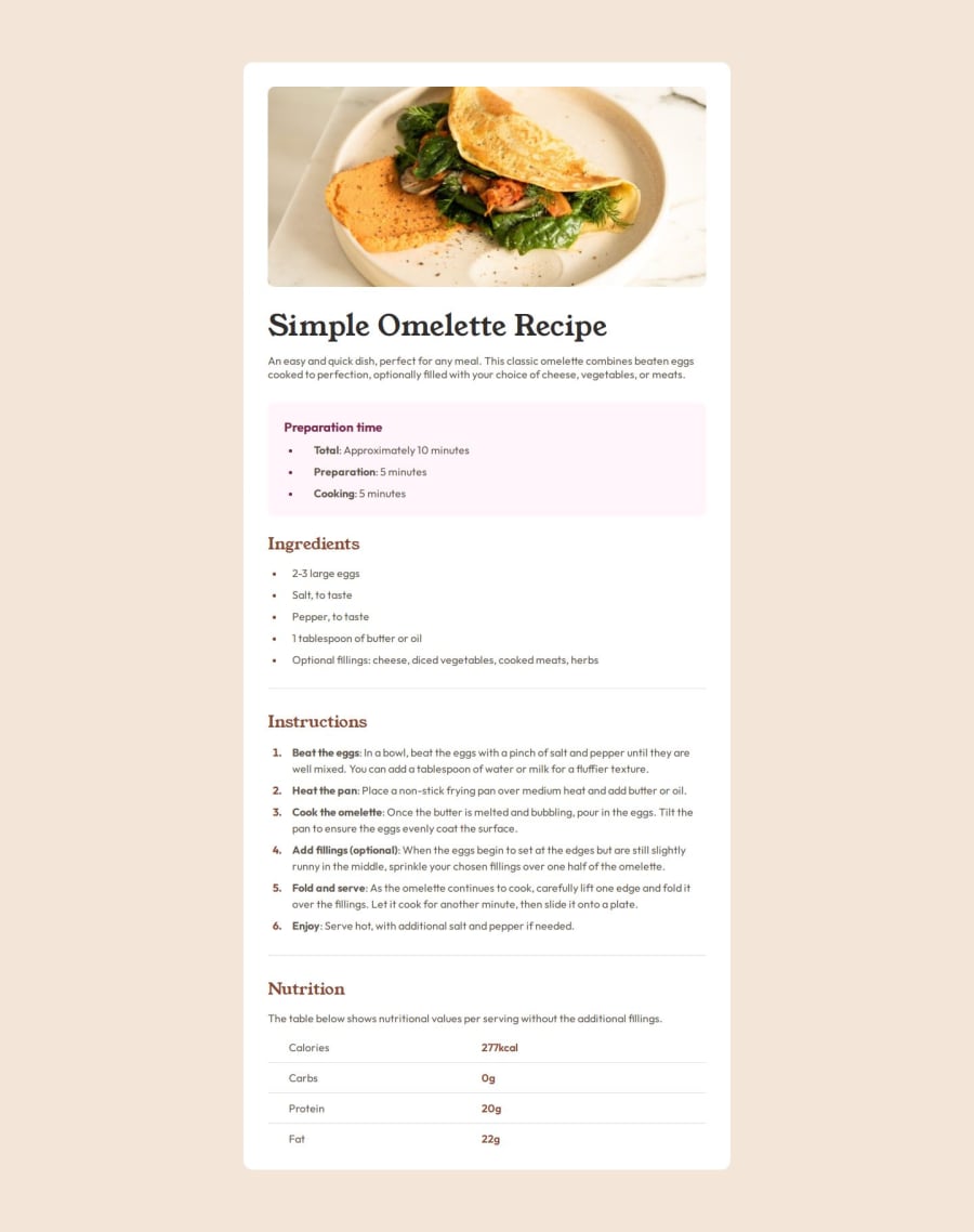
Design comparison
Solution retrospective
My use of psuedo elements and psuedo classes to efficiently style the elements.
What challenges did you encounter, and how did you overcome them?Spacing. Quickly looked up a spacing system to make sure most elements are uniformly spaced out.
What specific areas of your project would you like help with?In the mobile preview, where the first bullet point of the preparation time section, how do I make the bullet pointed vertically centered between the two paragraphs (both of the same li element)?
Community feedback
- @grace-snowPosted 11 months ago
This challenge is mainly designed to teach good html structure like
- ensuring headings are in order and don't skip heading levels.
- using strong for bold inline phrases/text.
- using a table for tabular data.
- using header cells and scope where appropriate in the table.
I also recommend
- don't use the html 62.5% font hack
- link fonts in the html head instead of css imports for marginally better performance.
- keep media queries all in the same css file, defined in rem or em. Mobile styles as the default and then add a min width media query only when you need to change properties for larger screens. This challenge actually doesn't need a media query at all. There's a post about this on the FEDmentor.dev too.
- always include a modern css reset at the start of the styles in every project. Andy Bell or Josh Comeau both have good ones you can look up and use.
- use rem and never px for font size
- don't set width in percentage on the component. Use max width in rem only instead.
Marked as helpful2@Leo-yagamiPosted 11 months ago@grace-snow If i use strong, how do i change the font weight then? Since the style guide specified two levels of bold: 600 and 700.
0@grace-snowPosted 11 months ago@Leo-yagami you can set it as part of an initial reset on the strong tag or with classes just like anything else. But you may not even need to, depending on the design. 600 is Semi-bold, 700 is bold. So the browser will use 700 on strong by default. If you need the strong to be 600 instead, set that in your css.
Strong has meaning. It means this text is bold emphasised and is announced as such by some screen readers depending on settings. Span is meaningless so only used when the styling on text isn't being applied for emphasis.
1
Please log in to post a comment
Log in with GitHubJoin our Discord community
Join thousands of Frontend Mentor community members taking the challenges, sharing resources, helping each other, and chatting about all things front-end!
Join our Discord
