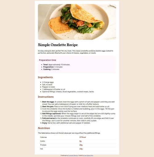
Recipe Page using HTML and CSS

Solution retrospective
I had been doing tutorials on W3 Schools and watched a lot of youtube tutorials but I have never built a site before. It's not 100% exactly like it was drawn up. But I'm proud that even when I struggled, I was able to figure out how to make it close to what it looked like.
What challenges did you encounter, and how did you overcome them?I had trouble trying to figure out the table. Because I wasn't sure if the td or the th tag. I eventually figured it out by using the inspect tool in Chrome and as I know basic HTML and CSS, I could figure out that it was a padding issue.
What specific areas of your project would you like help with?I wasn't sure what font-family was and I got that wrong. But wasn't sure how to change it. So, I'd want help on that.
I also feel like there was an easier way of how to do all of these things than I made so I'm curious about that.
Please log in to post a comment
Log in with GitHubCommunity feedback
No feedback yet. Be the first to give feedback on Boffdub's solution.
Join our Discord community
Join thousands of Frontend Mentor community members taking the challenges, sharing resources, helping each other, and chatting about all things front-end!
Join our Discord