Design comparison
Solution retrospective
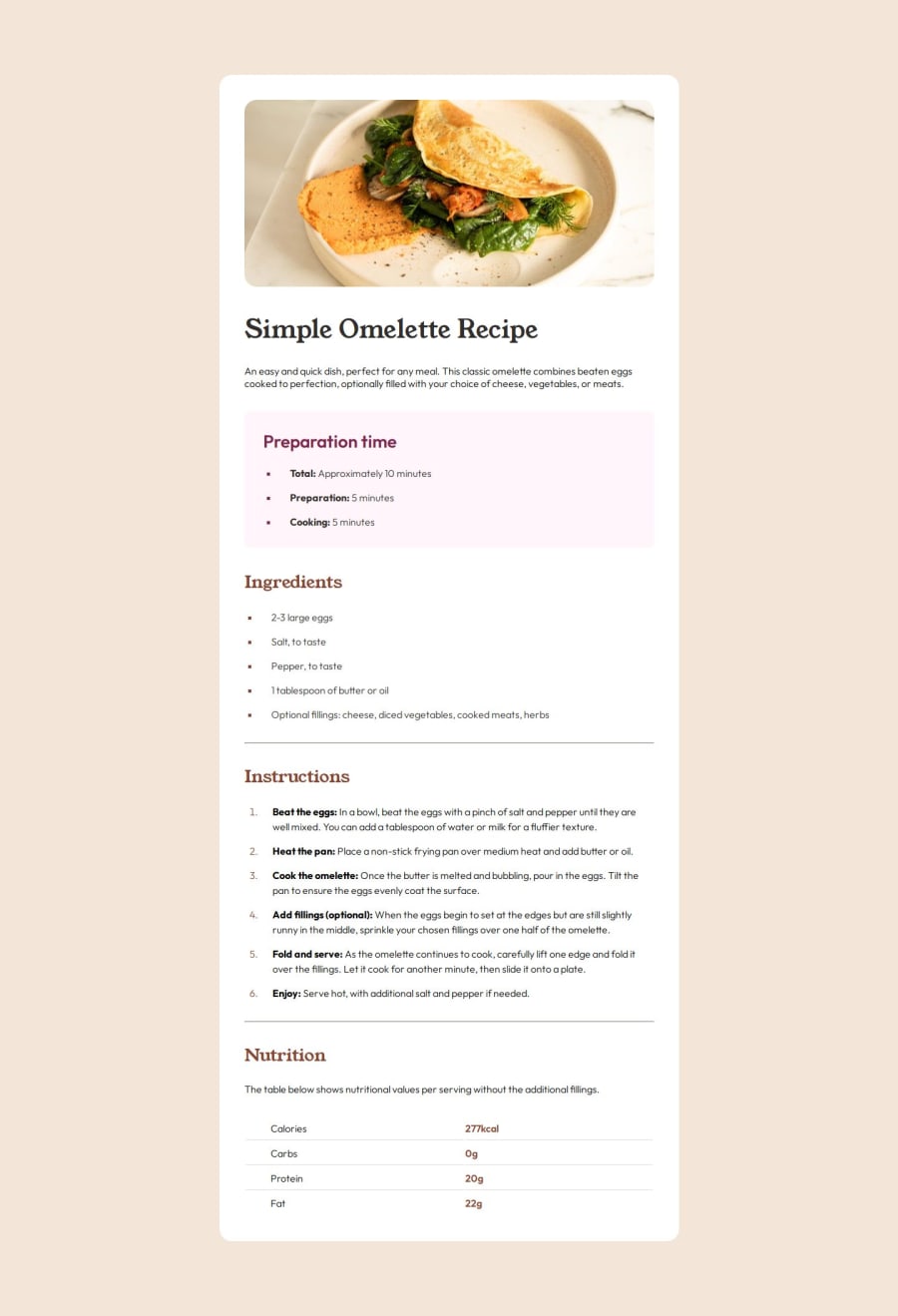
This is my first complete web page project. Since we don't have the Figma for free users, I tried to get the paddings and margins with GIMP, hope this is close enough !
What challenges did you encounter, and how did you overcome them?This project was a nice transition from what I already have learned with the previous ones, and the first where I encounter some difficulties. I managed to solve all of them except two.
What specific areas of your project would you like help with?That's the two things that I can improve:
- set space between the ol li bullets and the text
- the kind of table at the bottom...
Feel free to help me on these parts ! Thank you !
Community feedback
- @keyulePosted about 1 year ago
Instead of divs and giving it a classname of table use a html table.
https://www.w3schools.com/html/html_tables.asp
1@MaxCodeCraftPosted about 1 year ago@keyule Thank you, I was lazy on this one since I don't know it well, but I improved my solution with table !
0
Please log in to post a comment
Log in with GitHubJoin our Discord community
Join thousands of Frontend Mentor community members taking the challenges, sharing resources, helping each other, and chatting about all things front-end!
Join our Discord
